
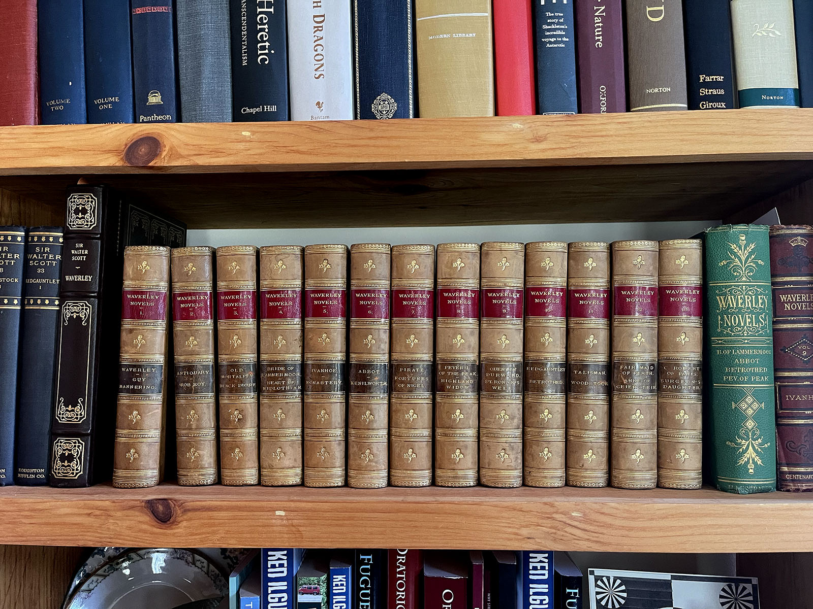
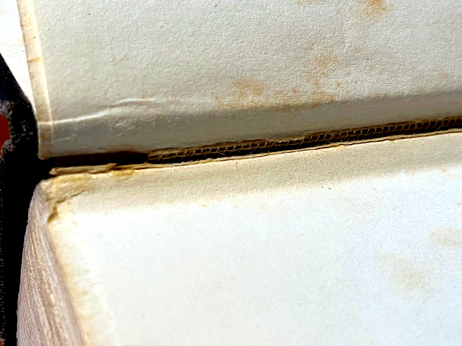
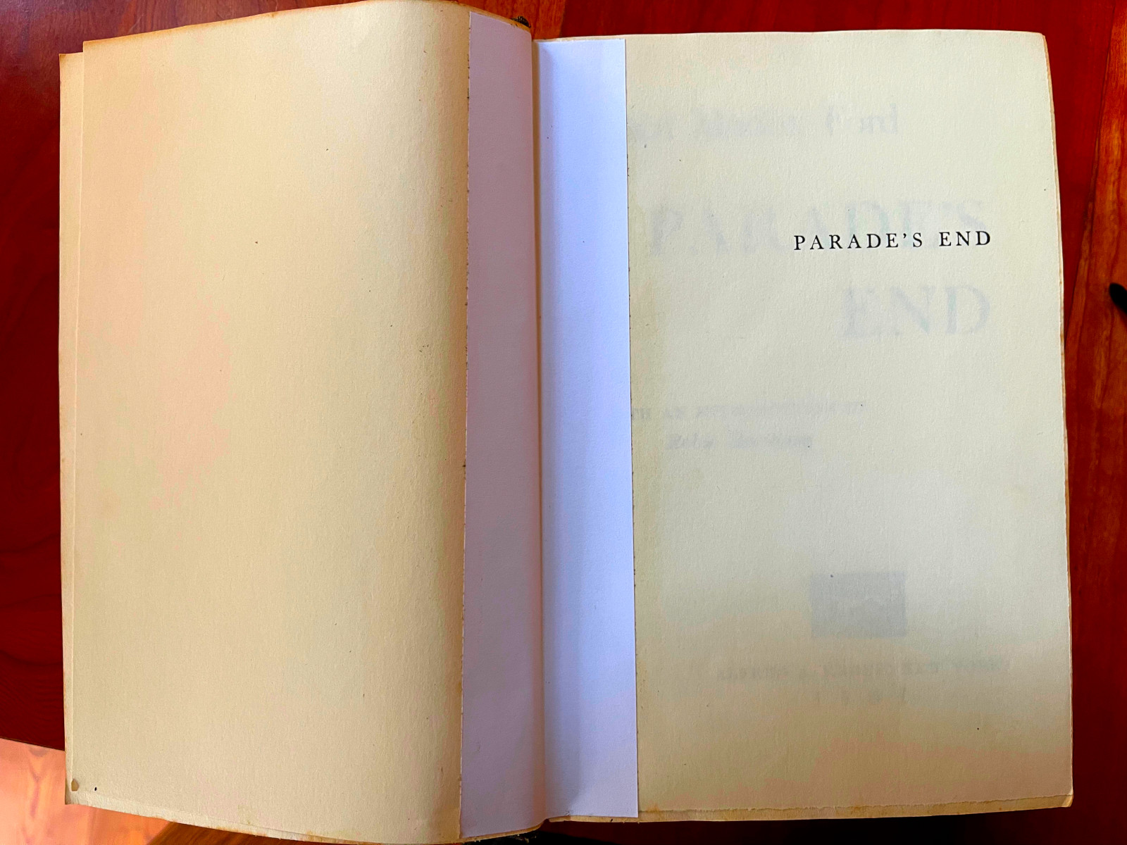
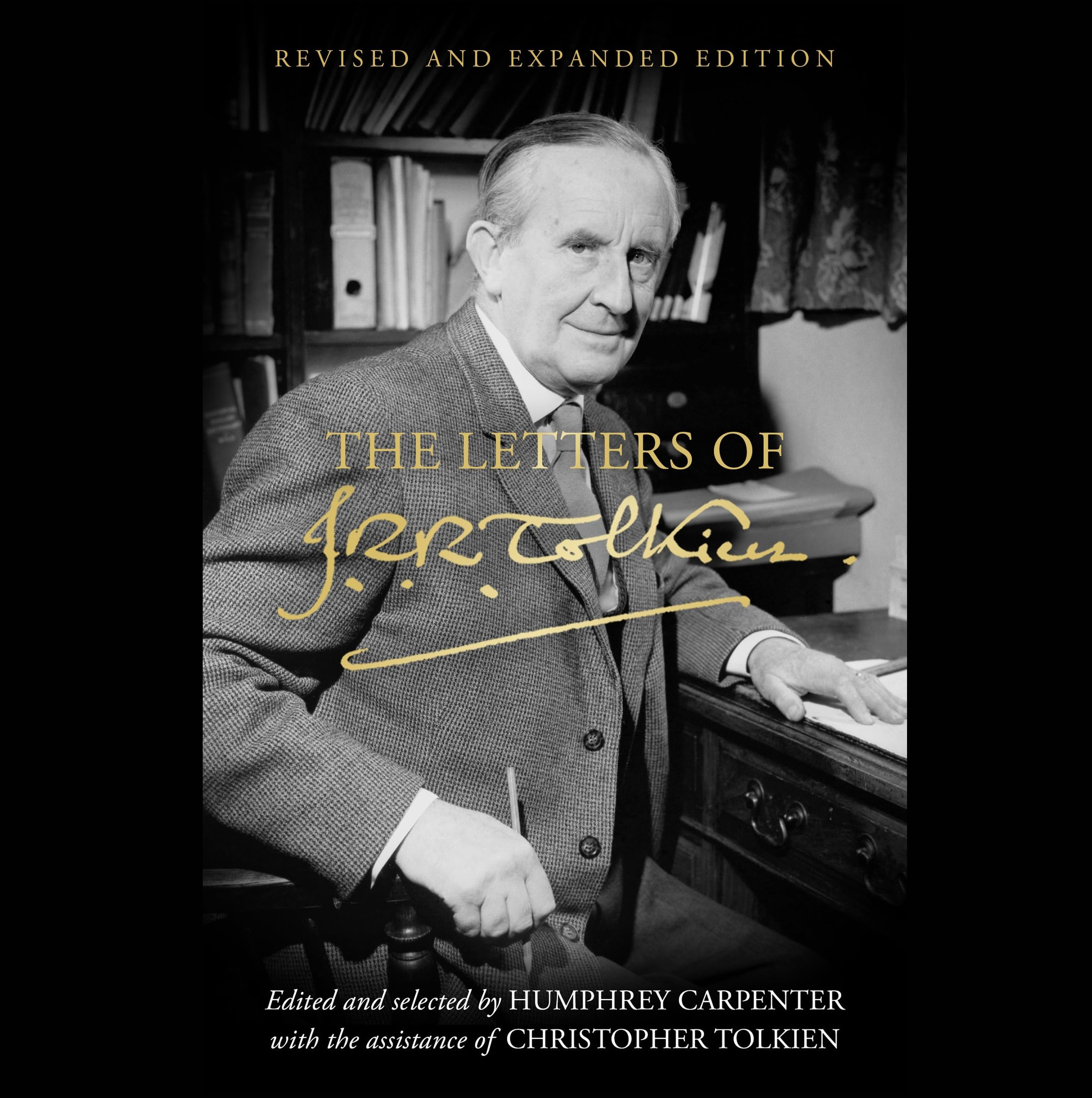
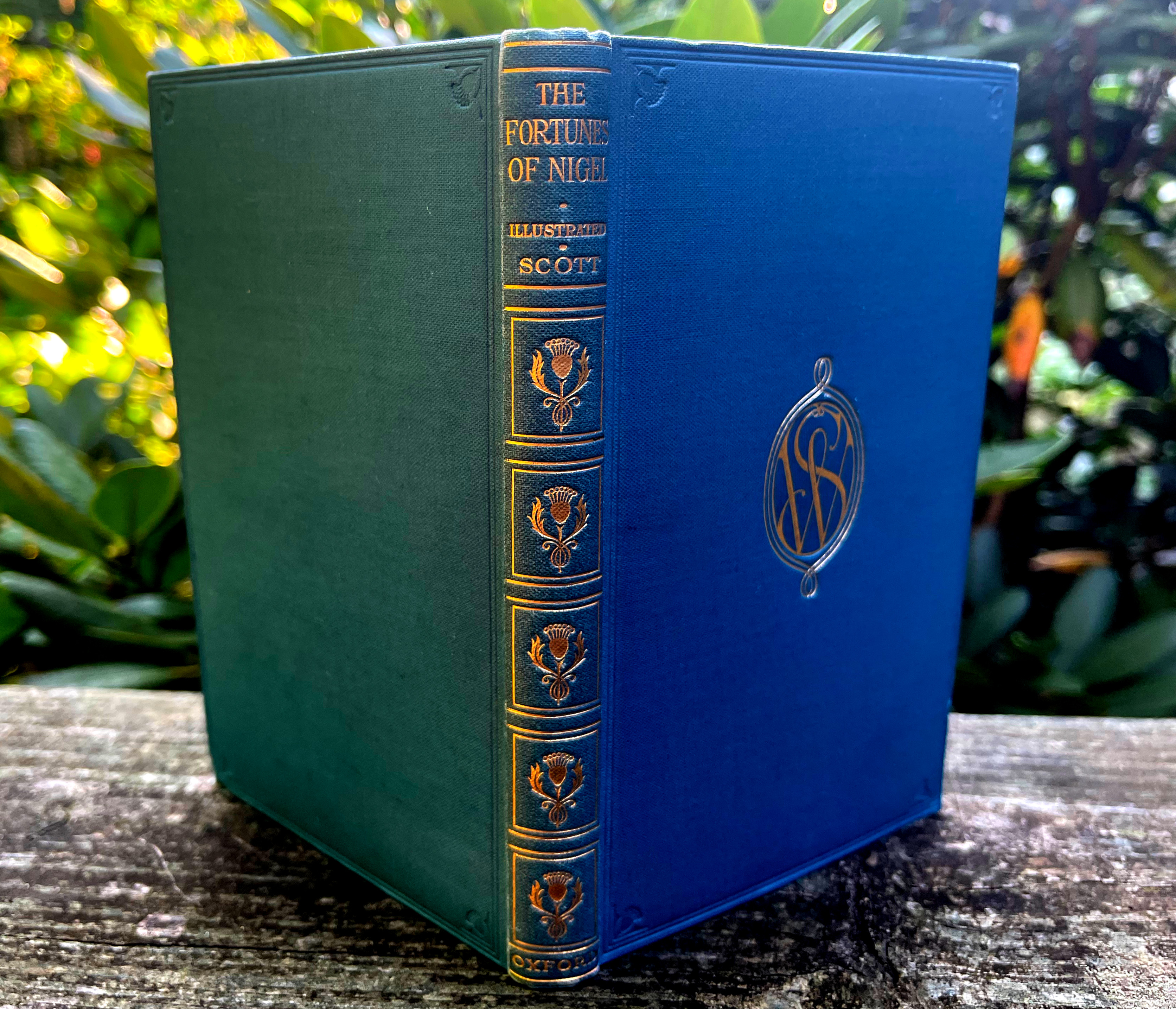
The books were a birthday gift
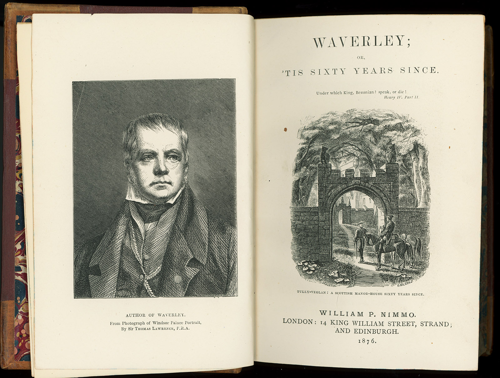
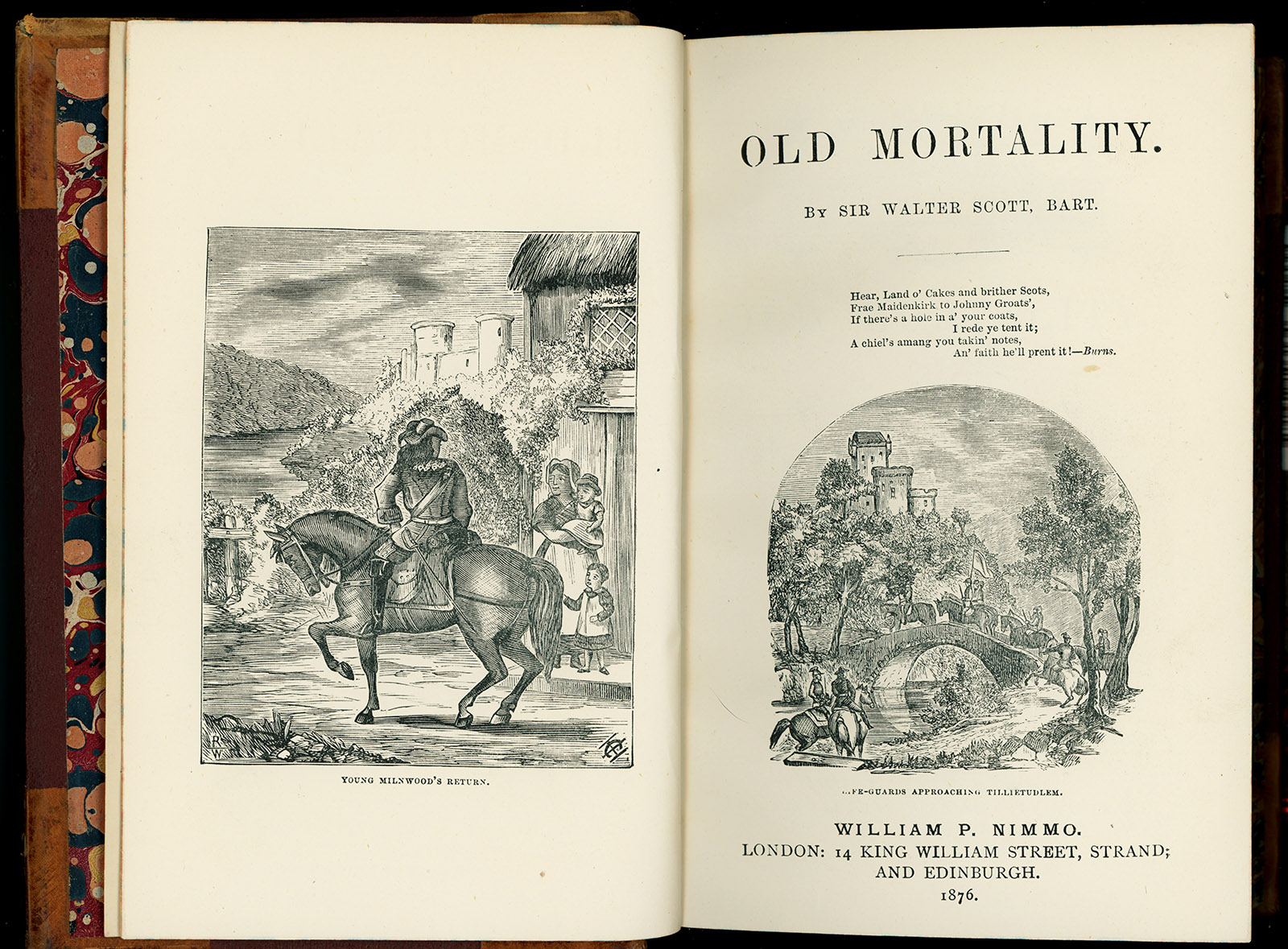
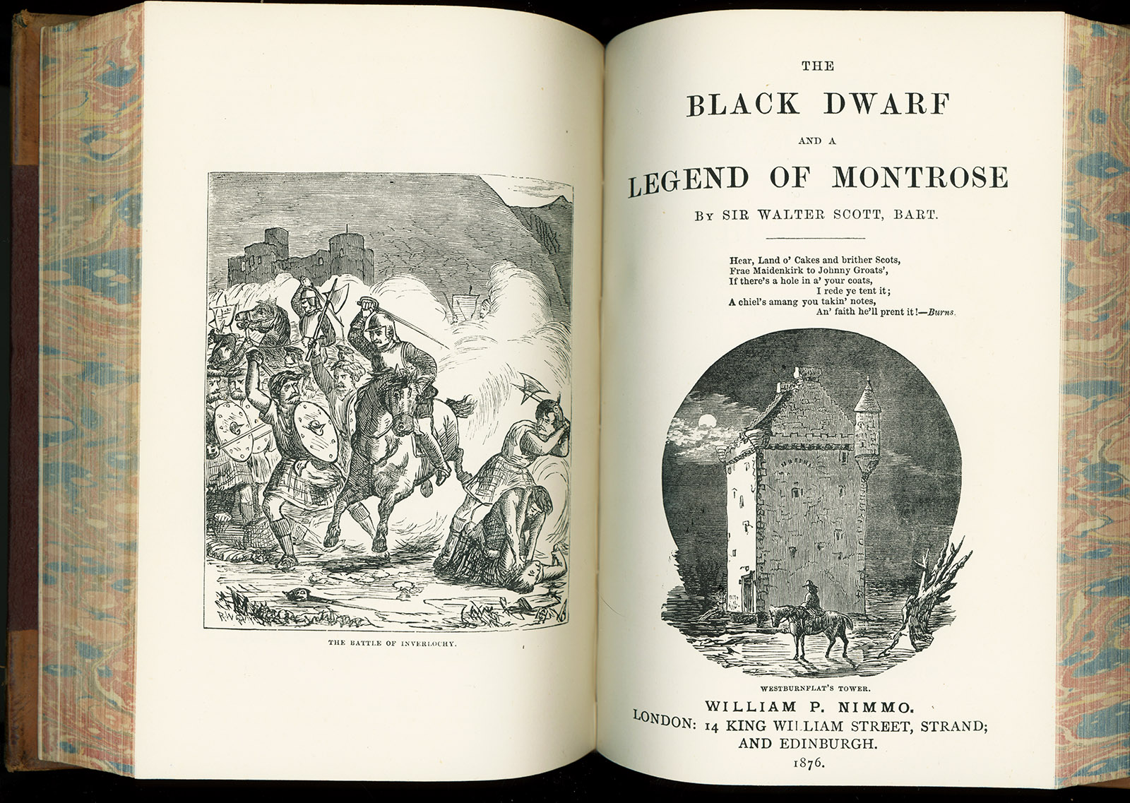
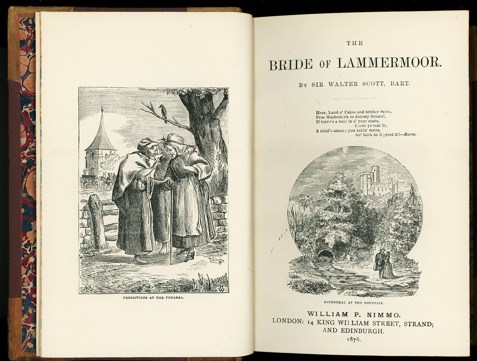
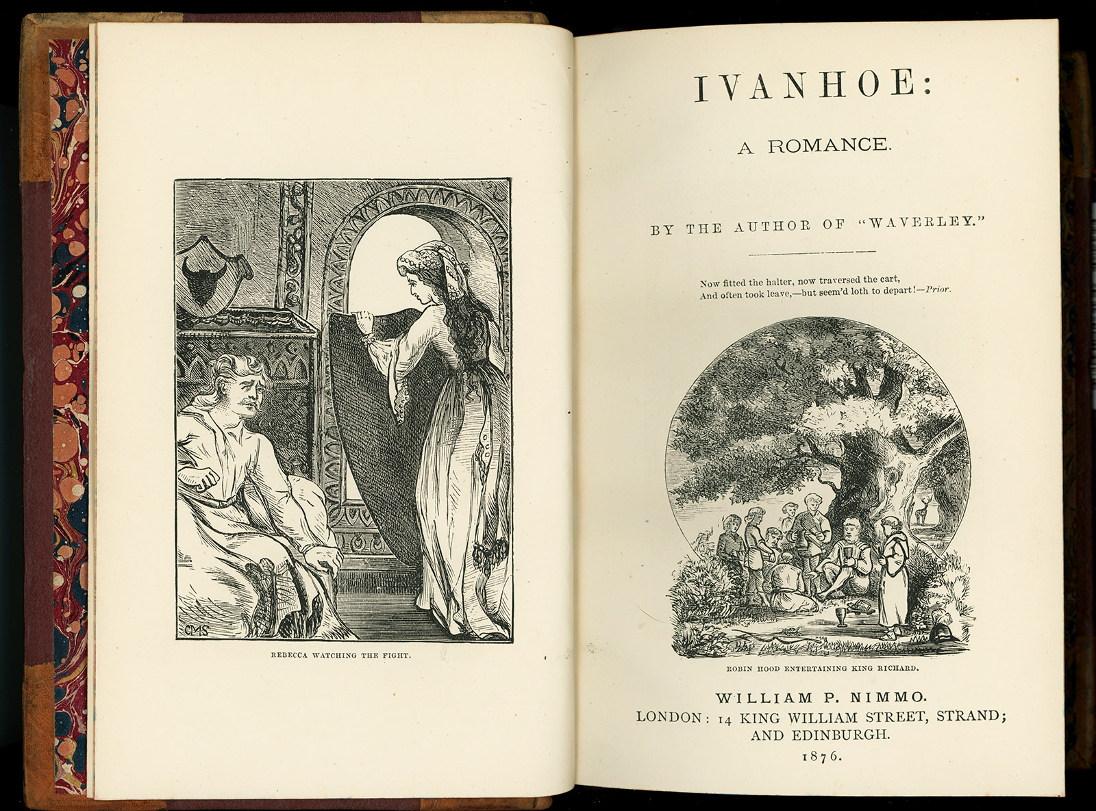
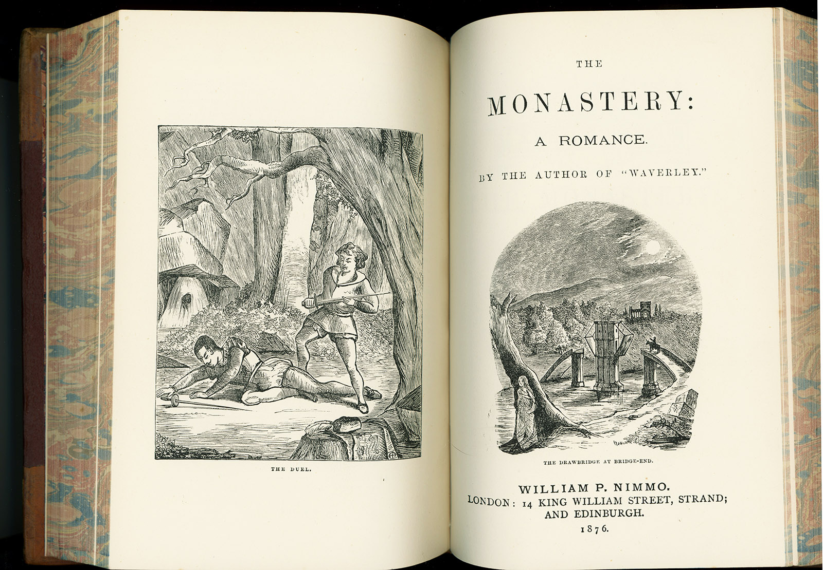
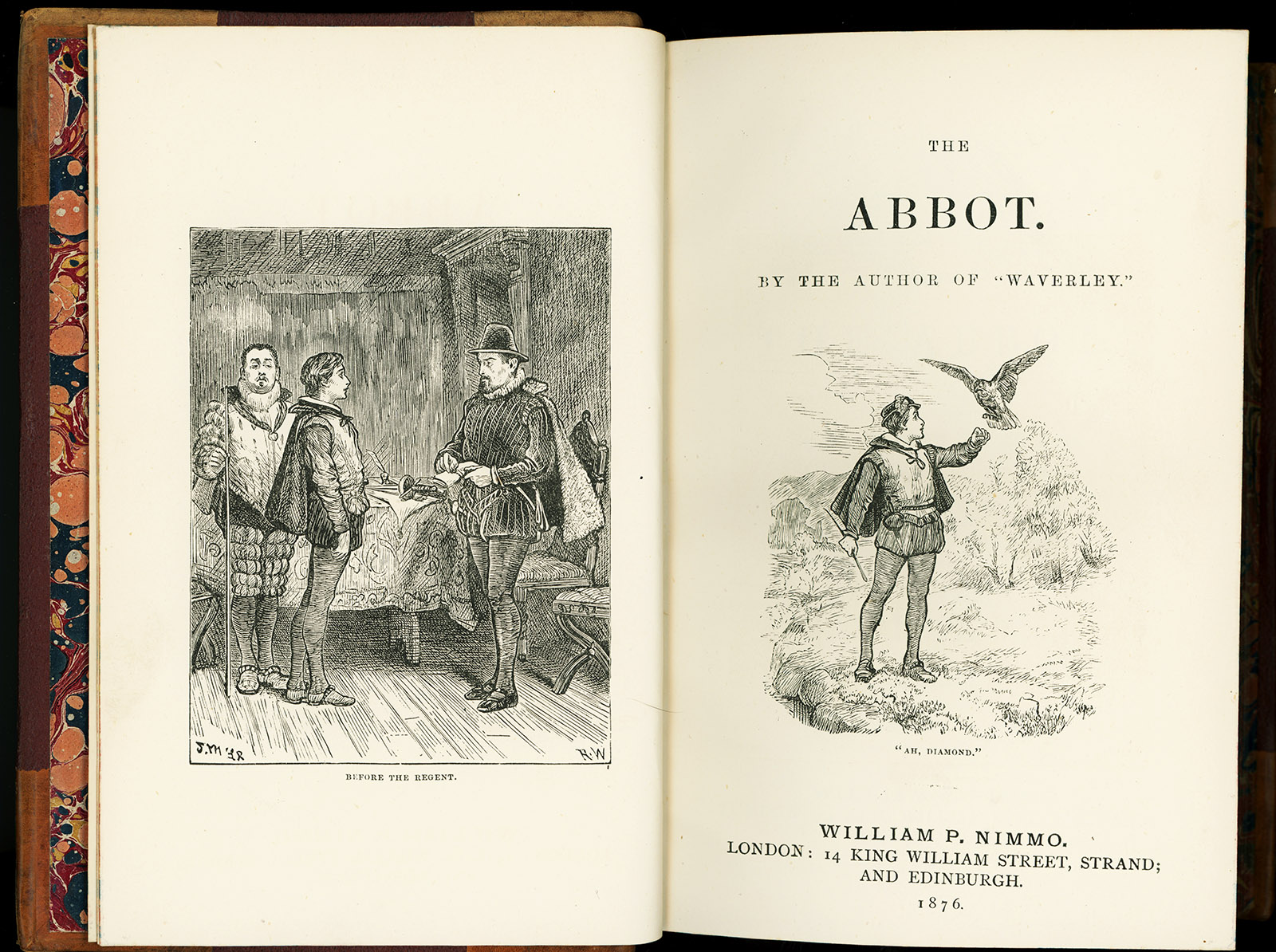
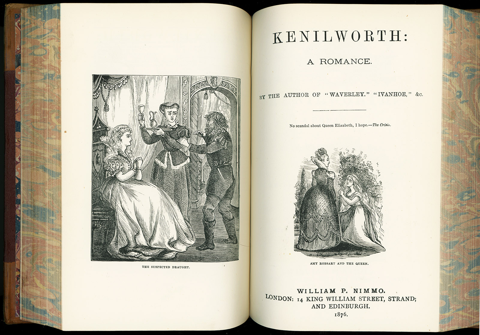
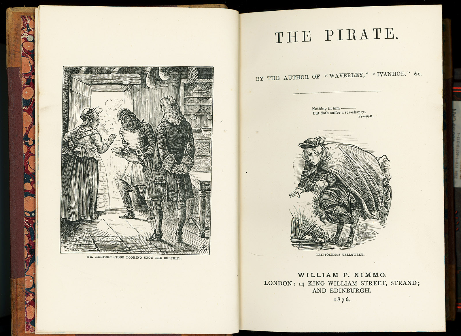
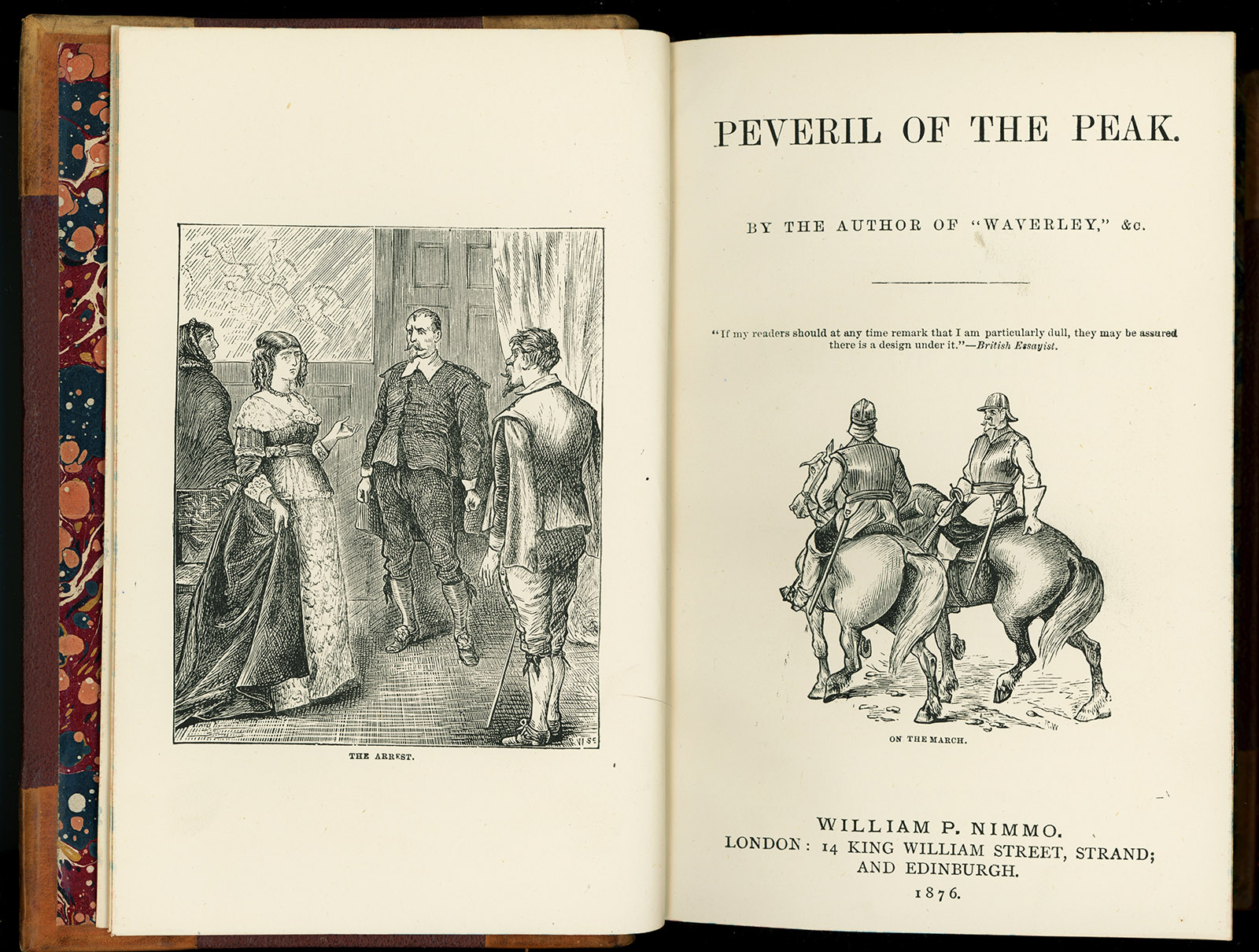
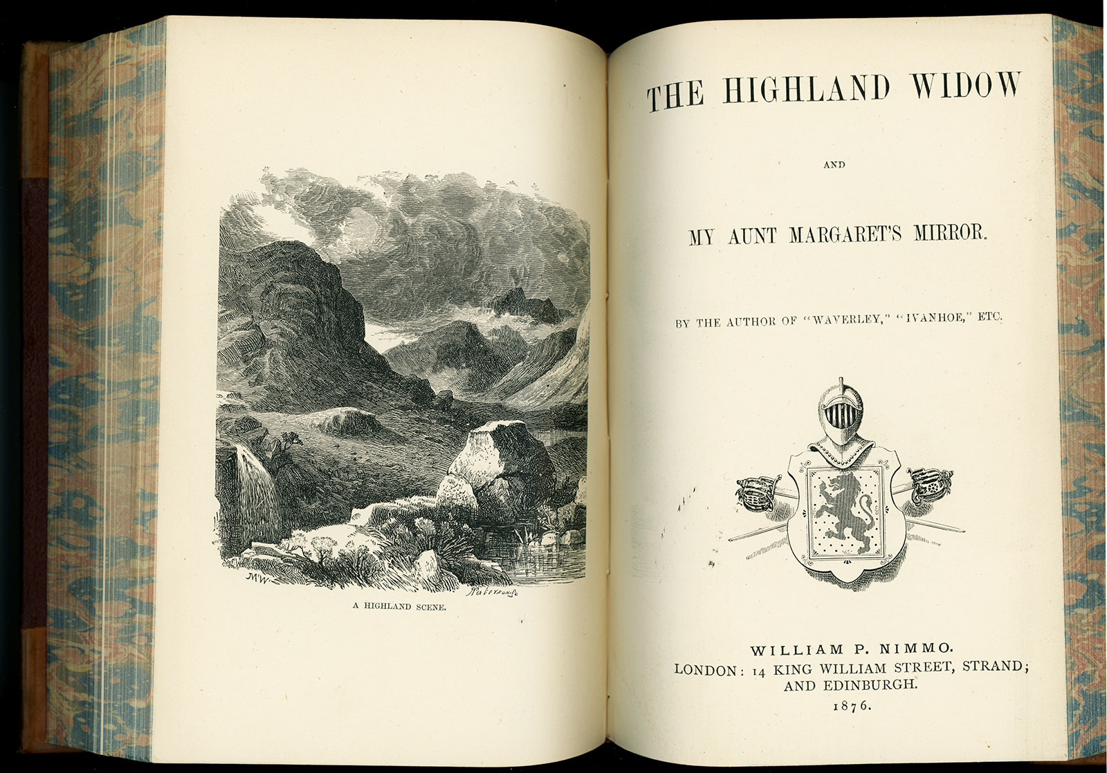
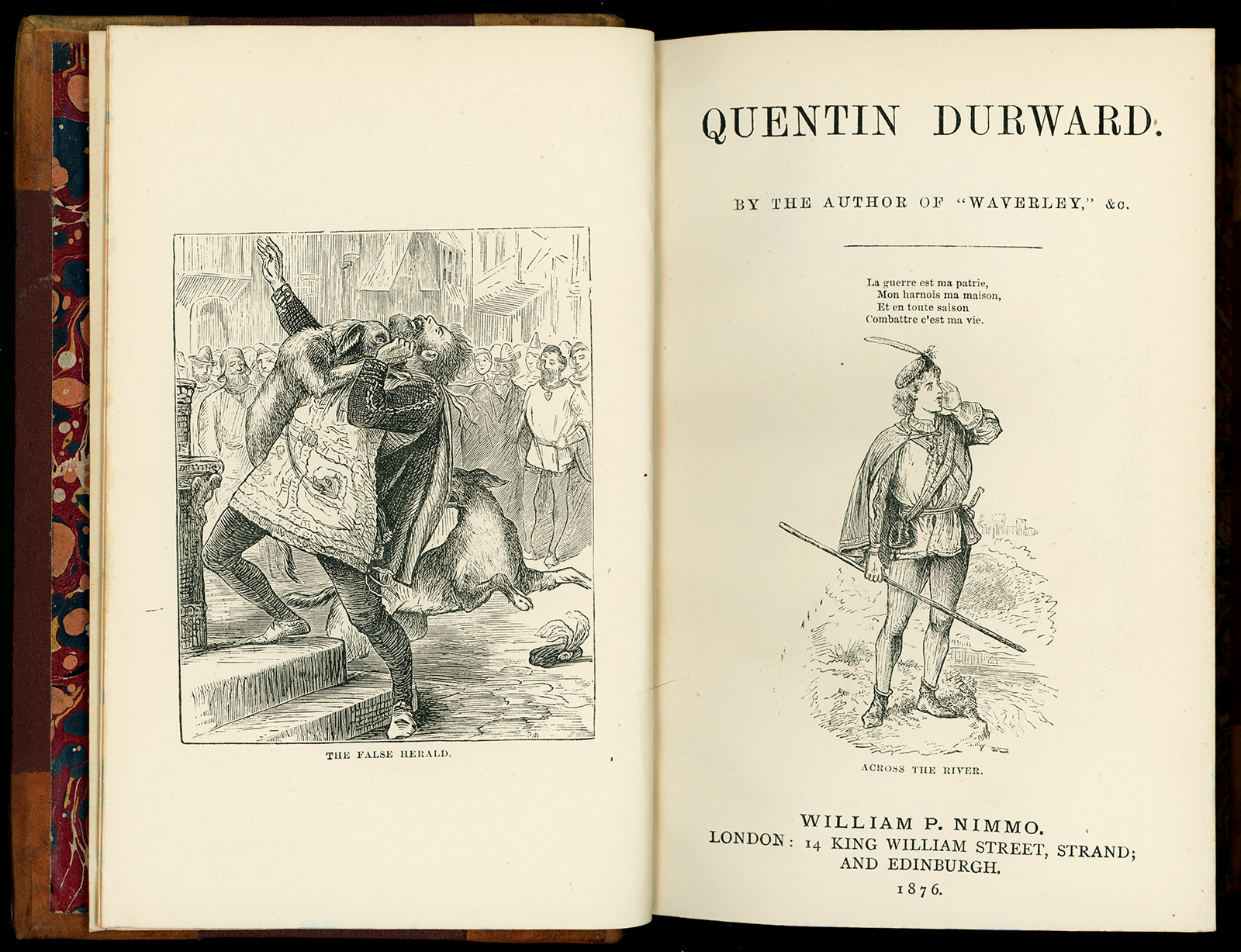
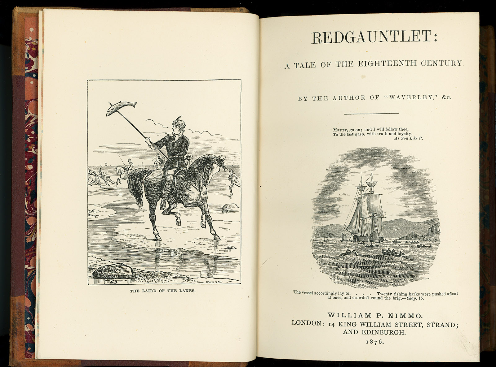
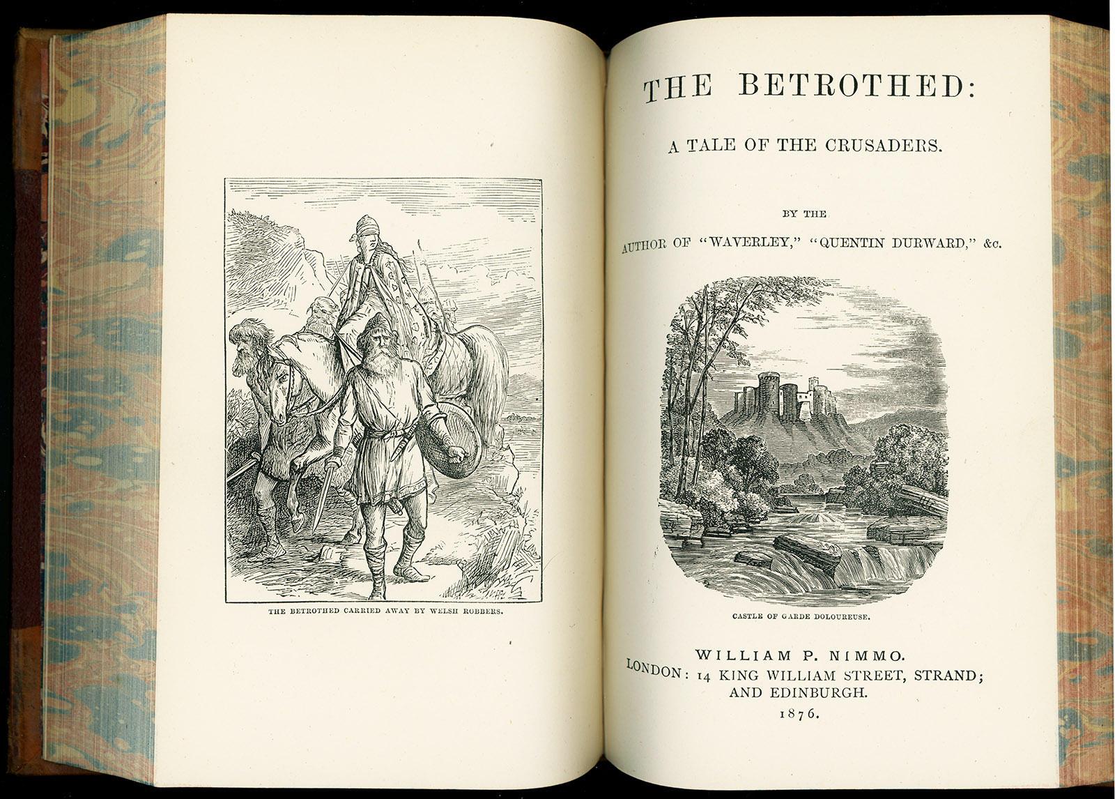
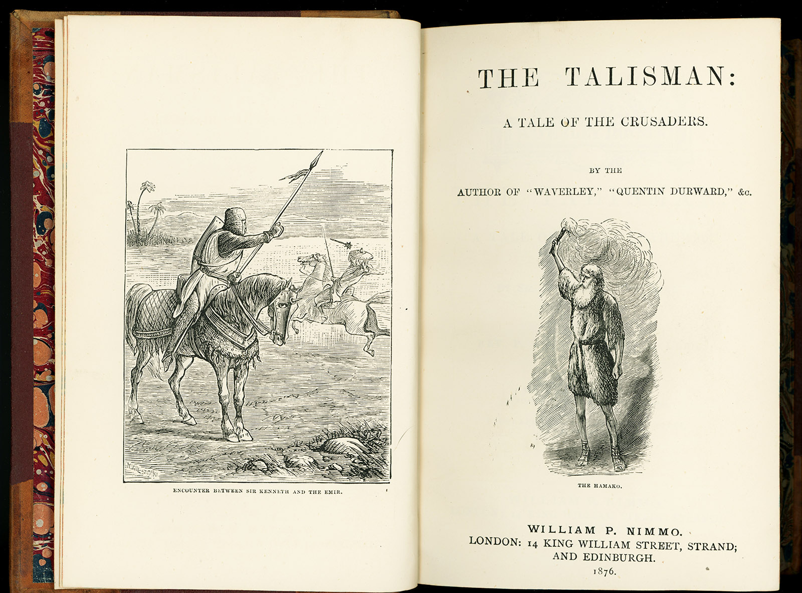
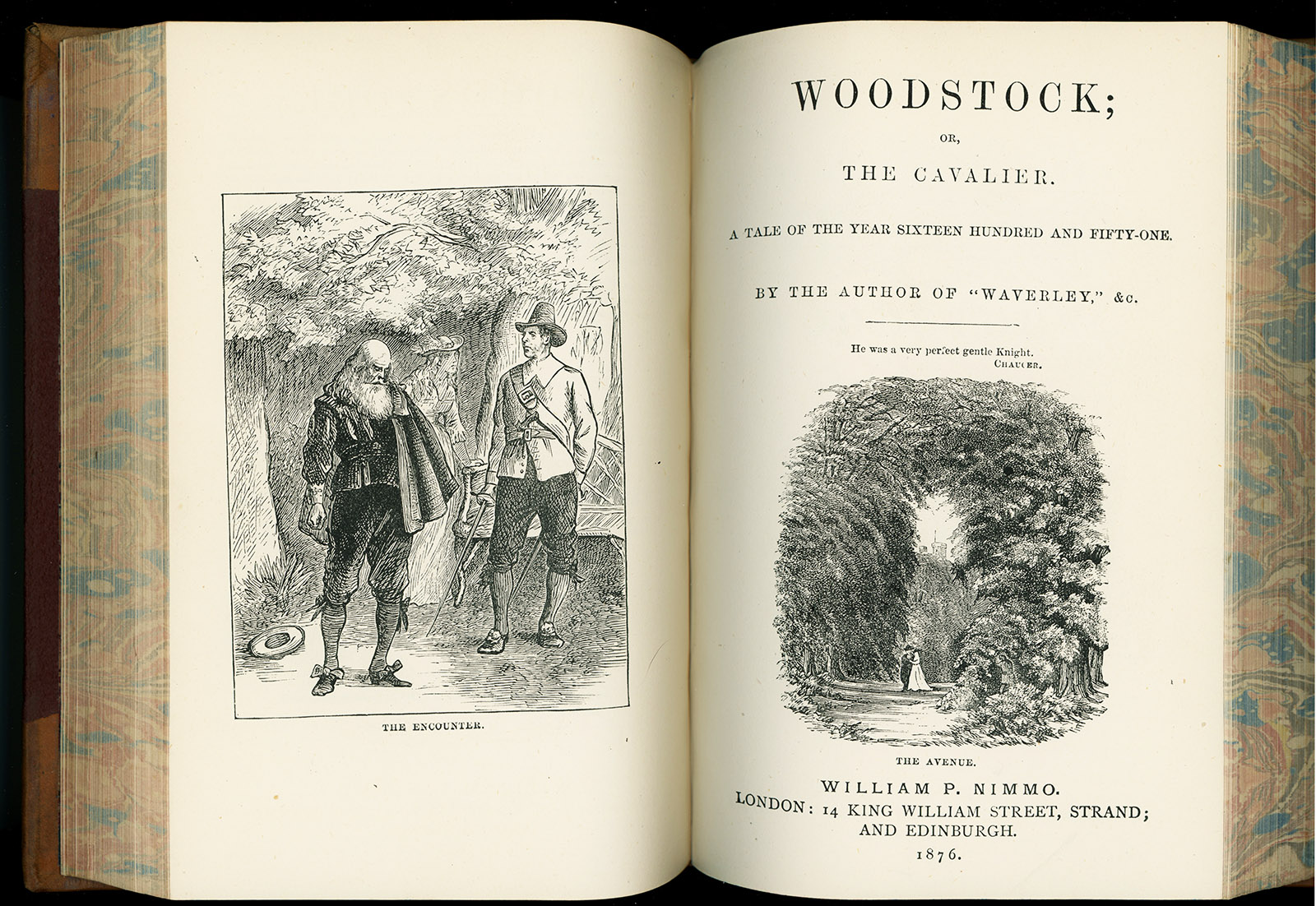
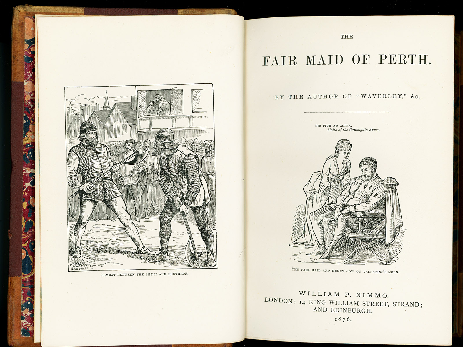
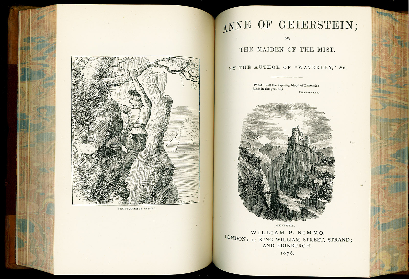
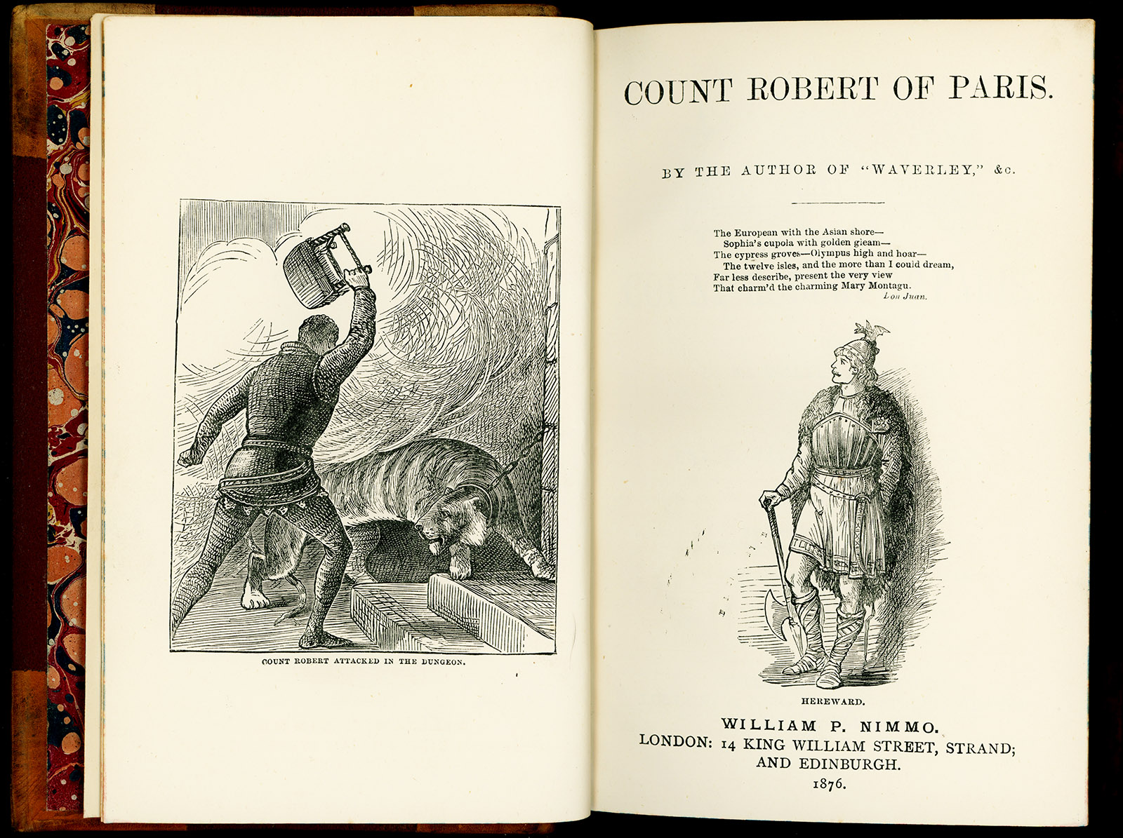
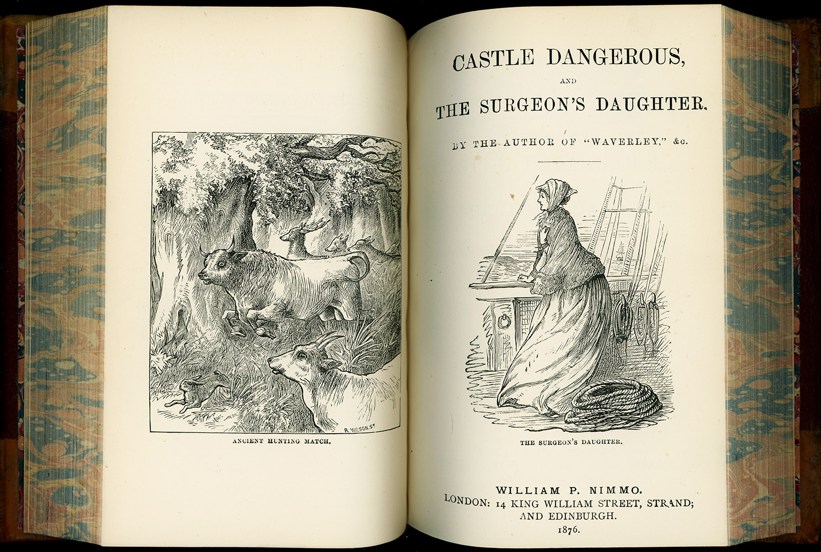
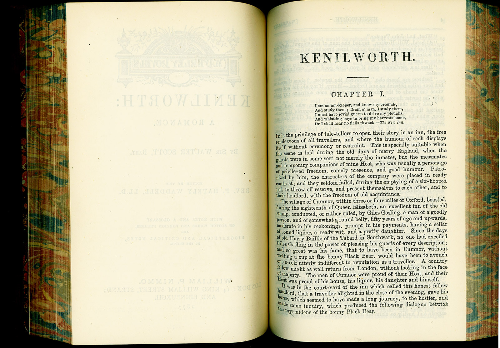
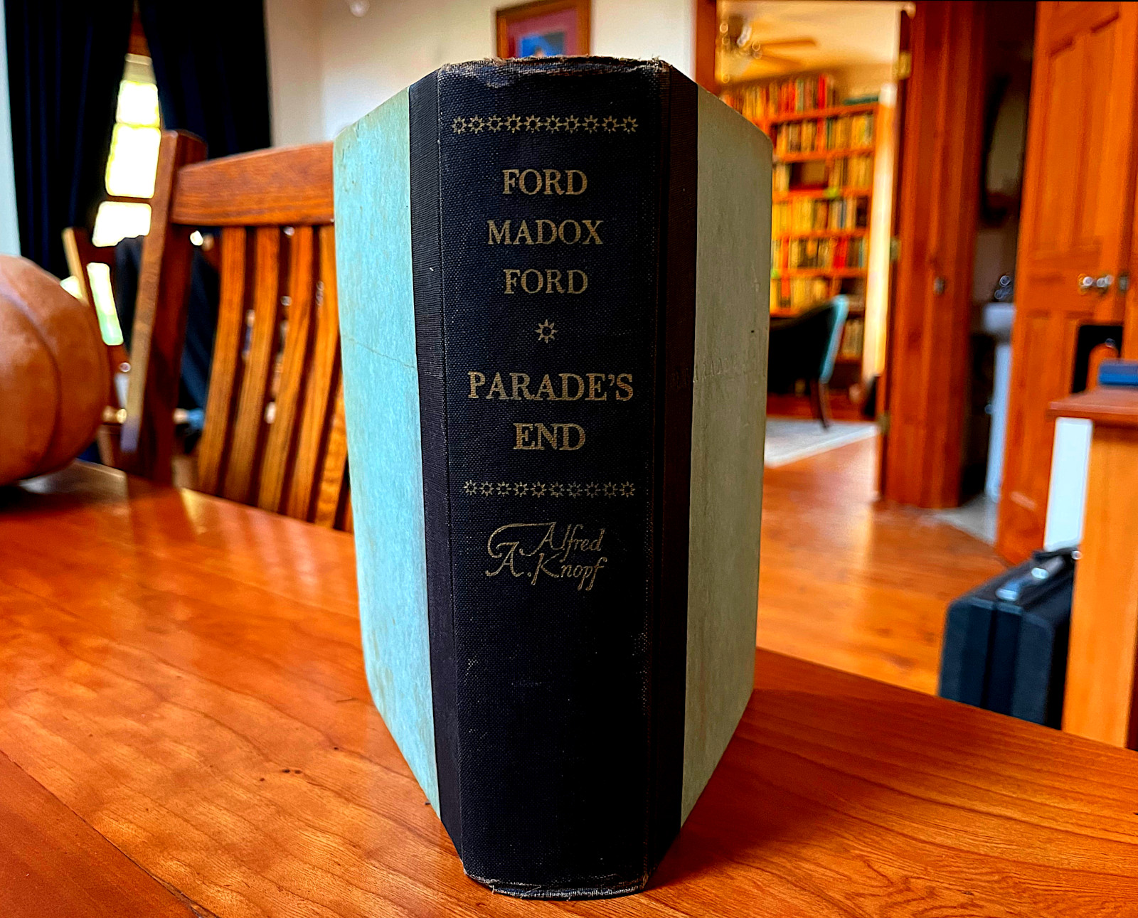
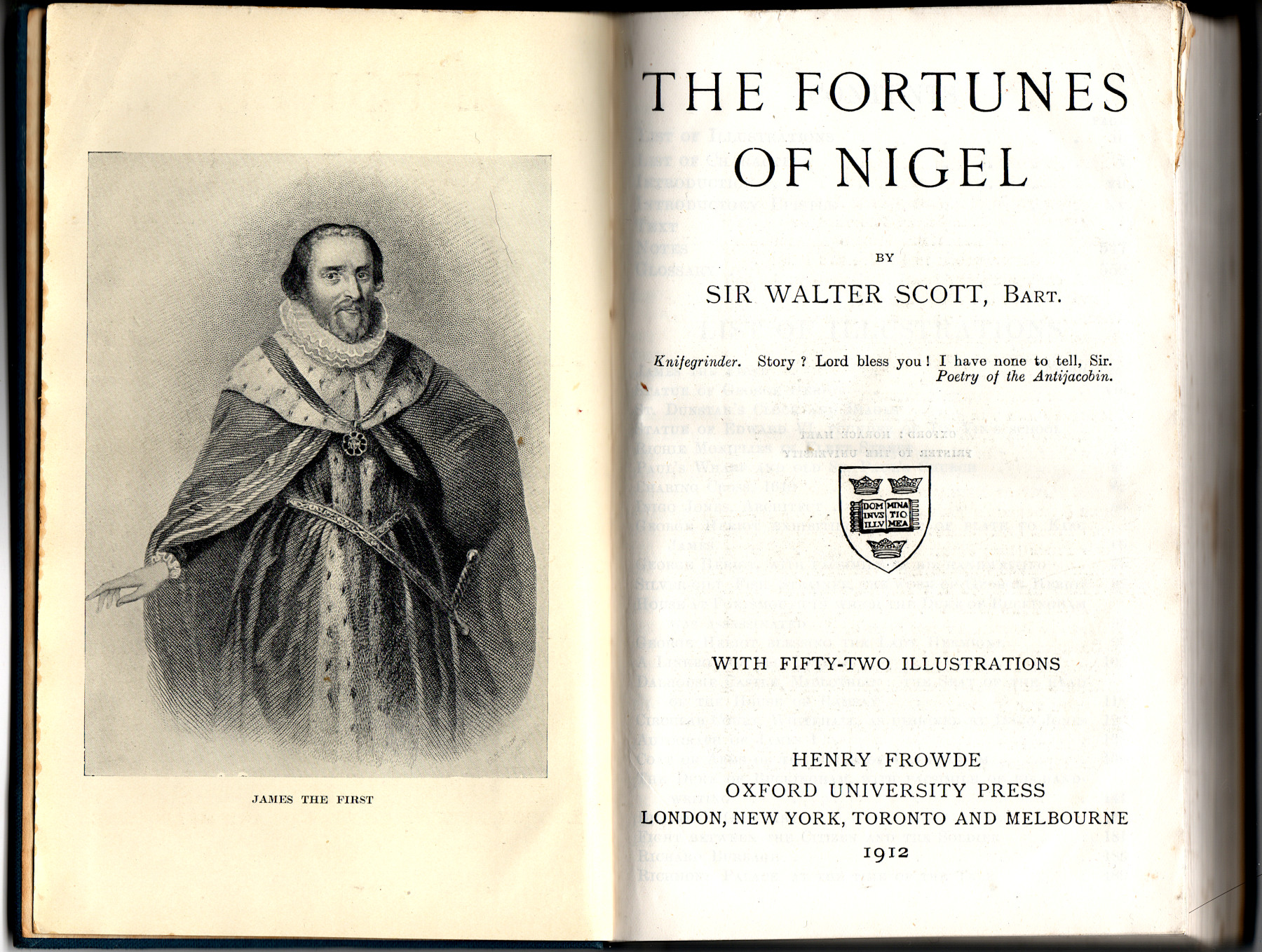
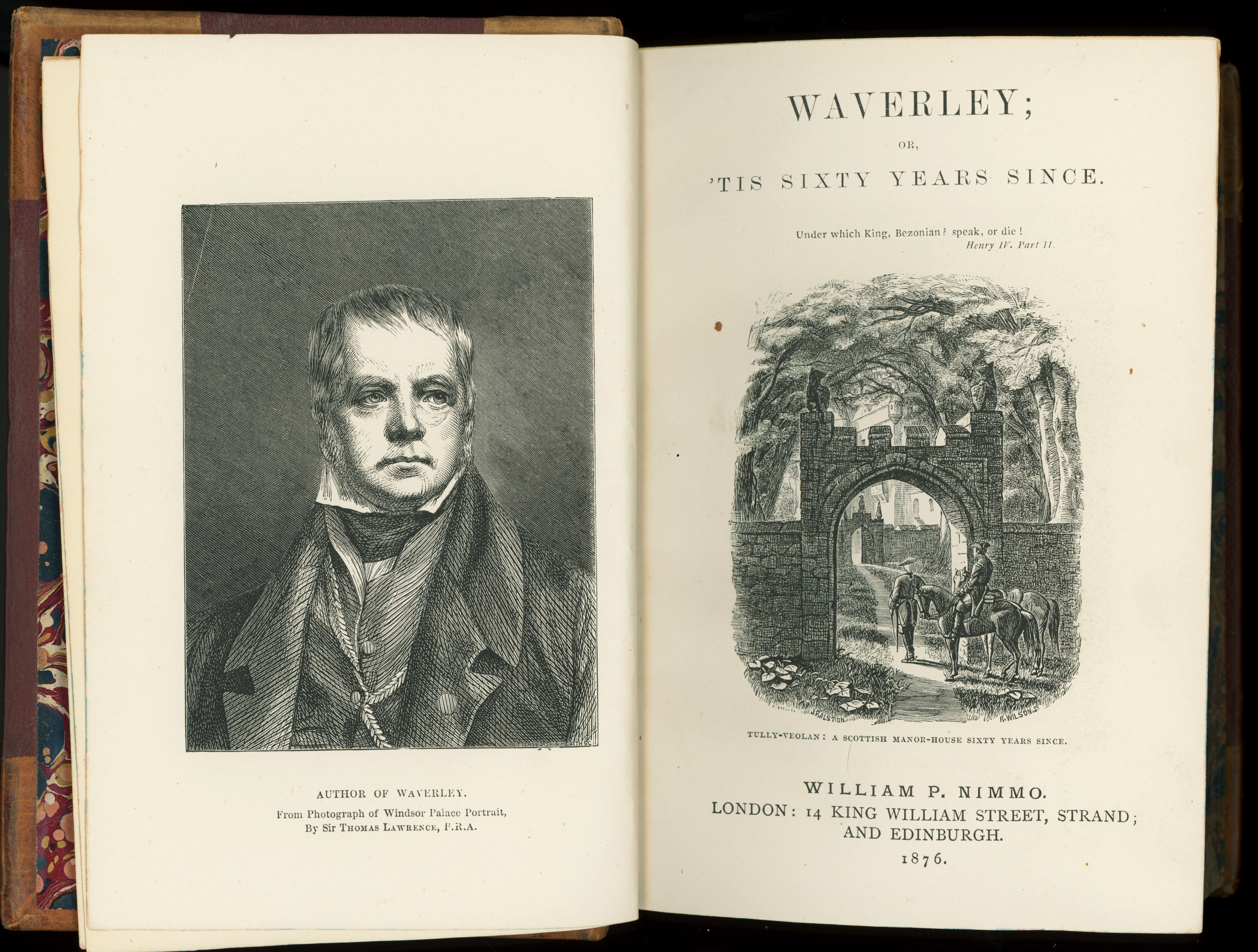
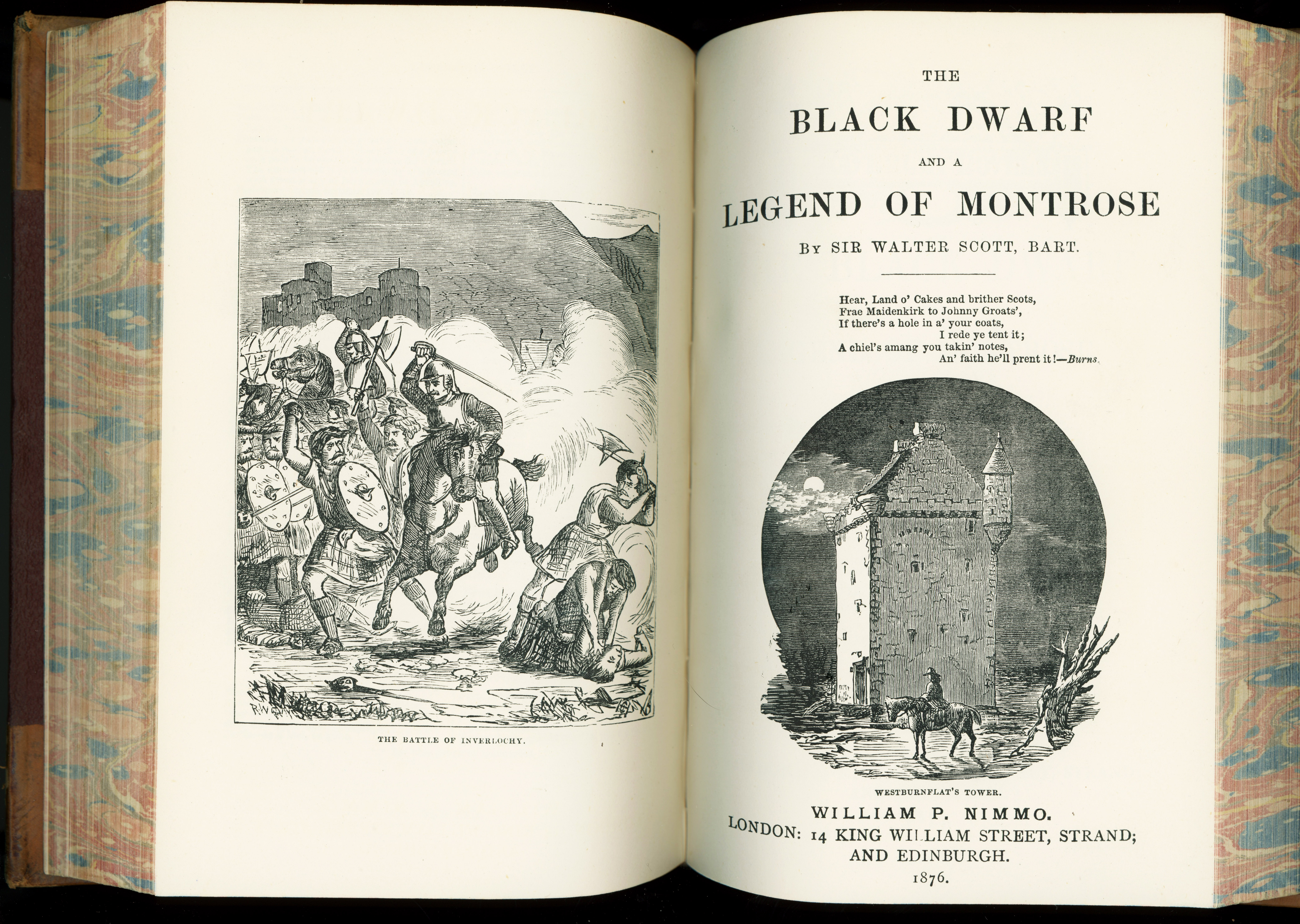
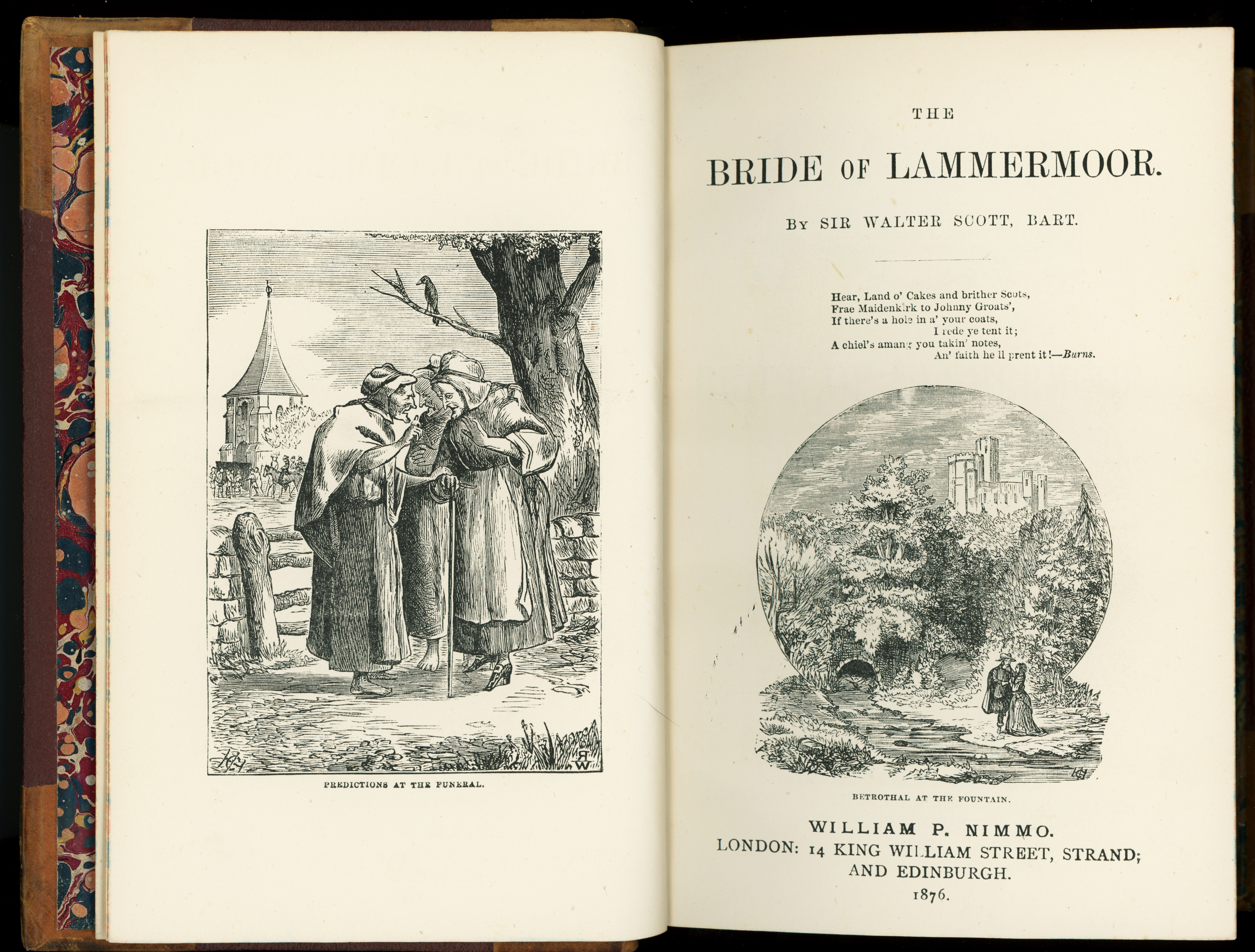
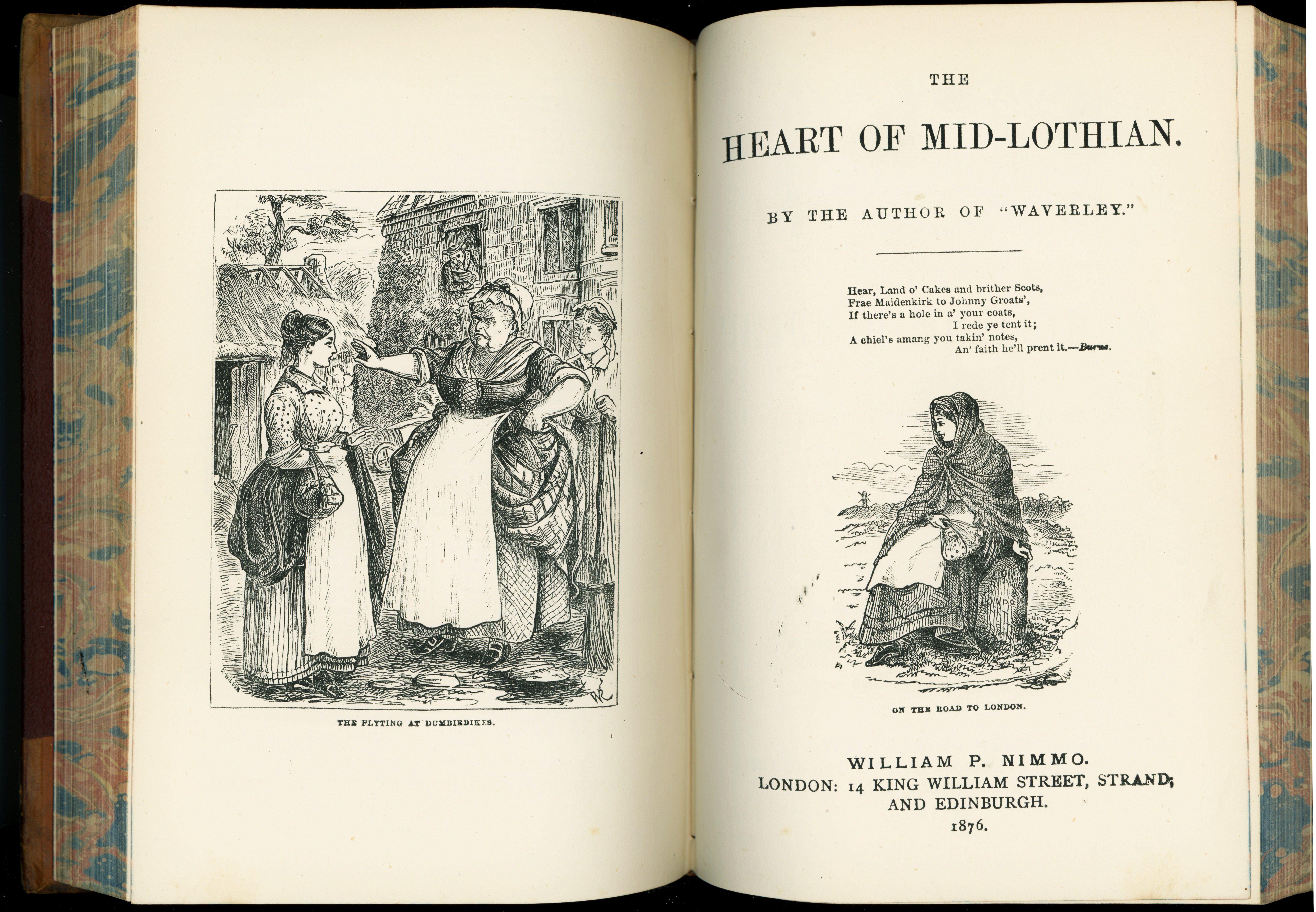
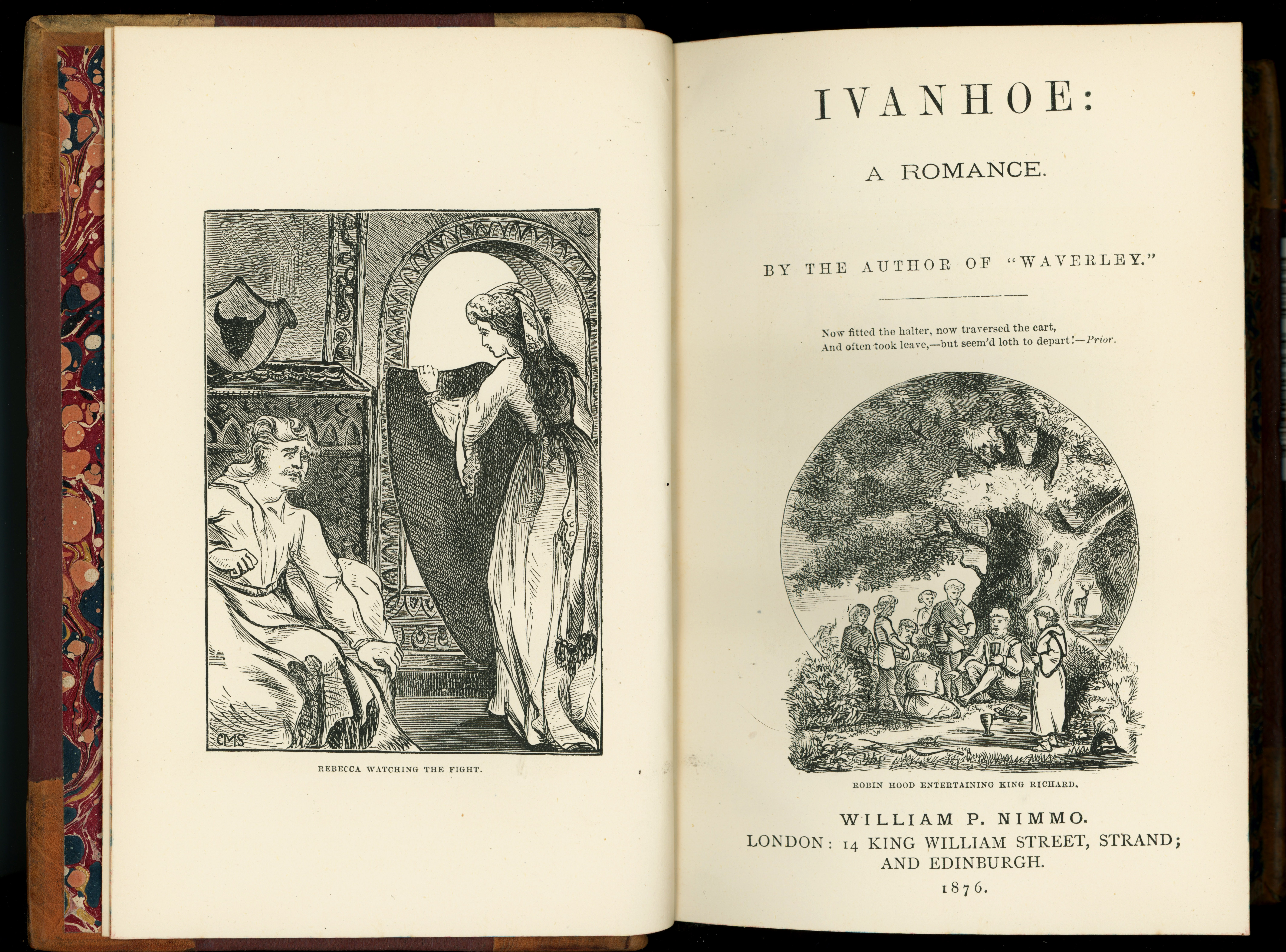
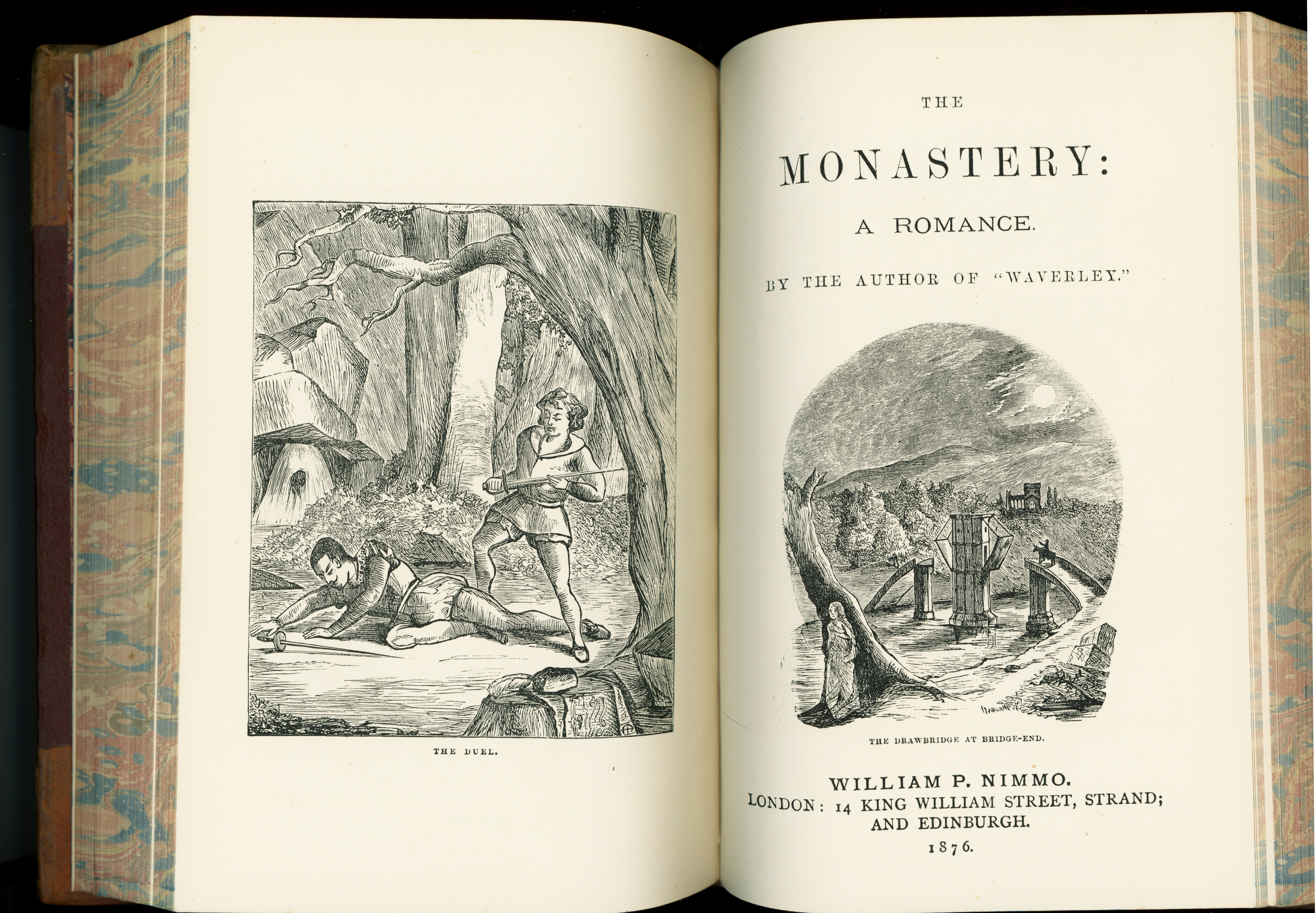
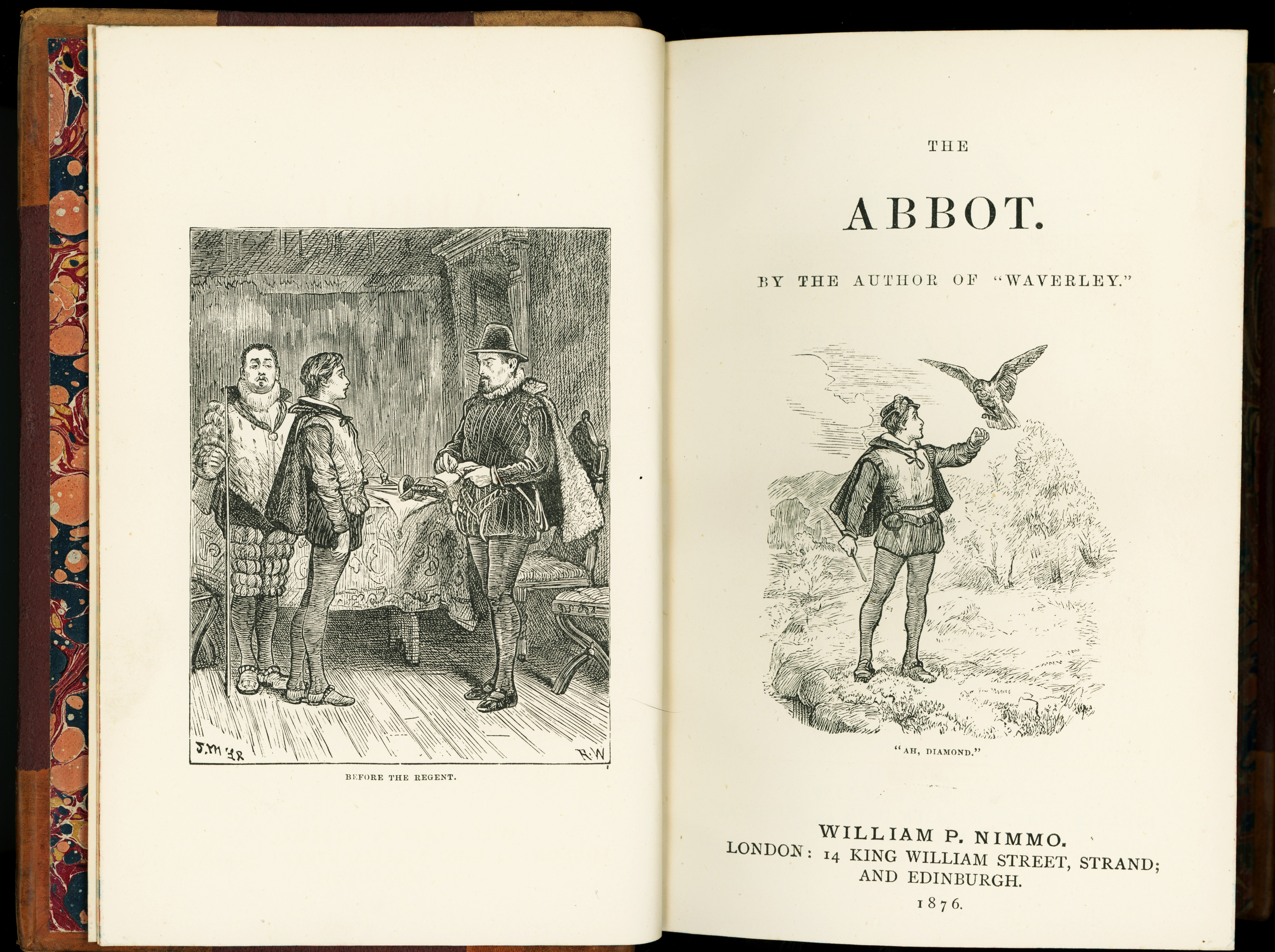
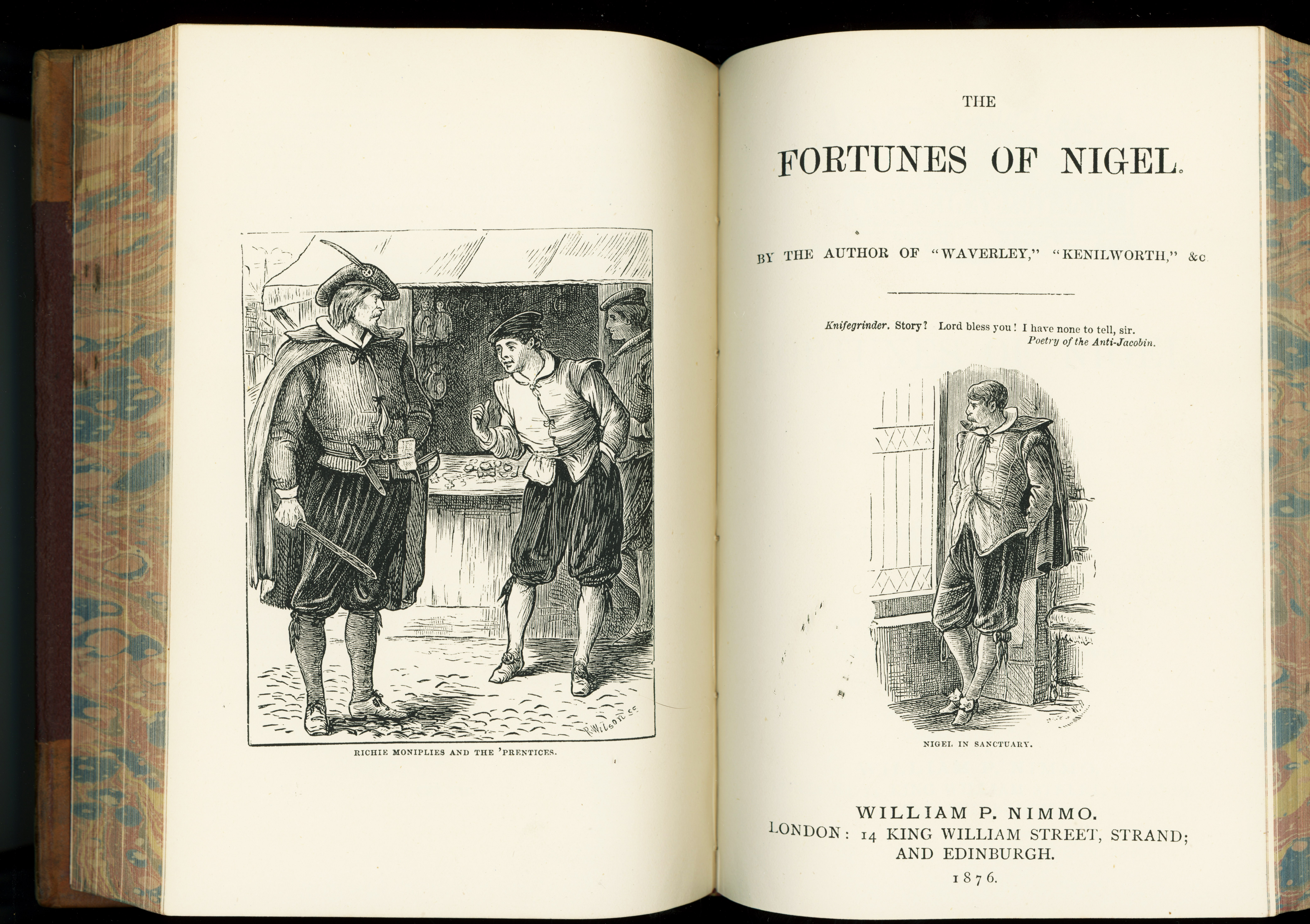
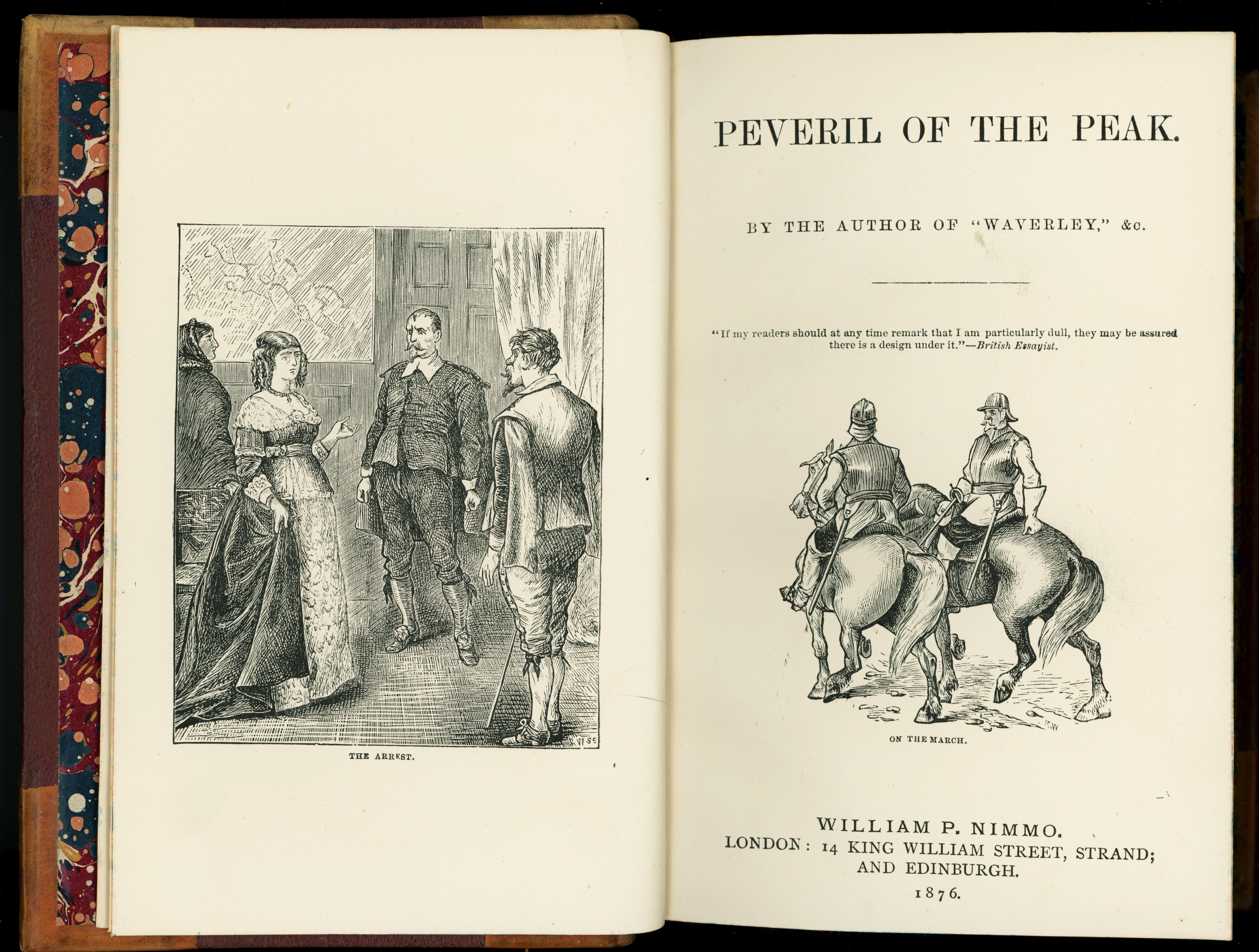
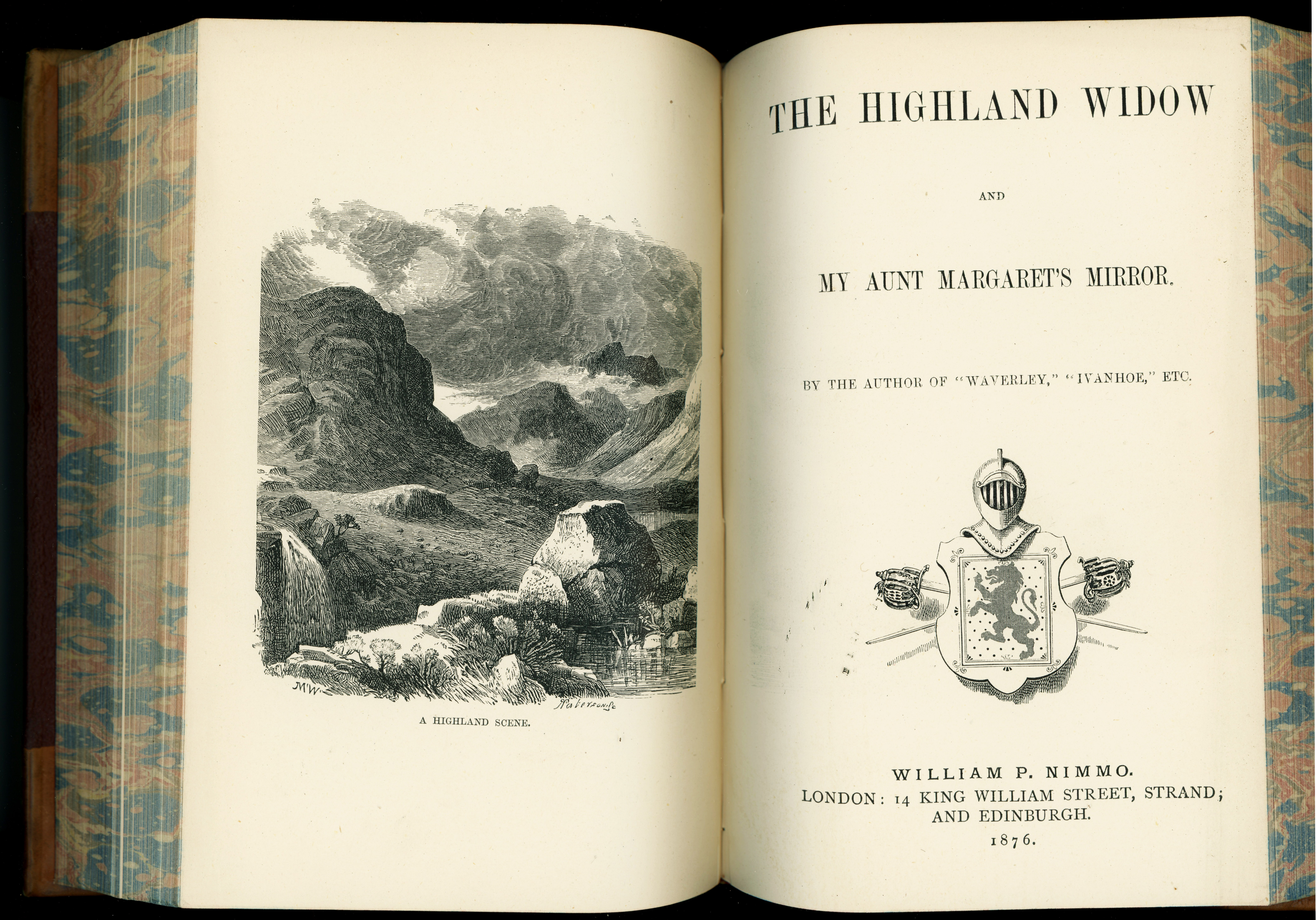
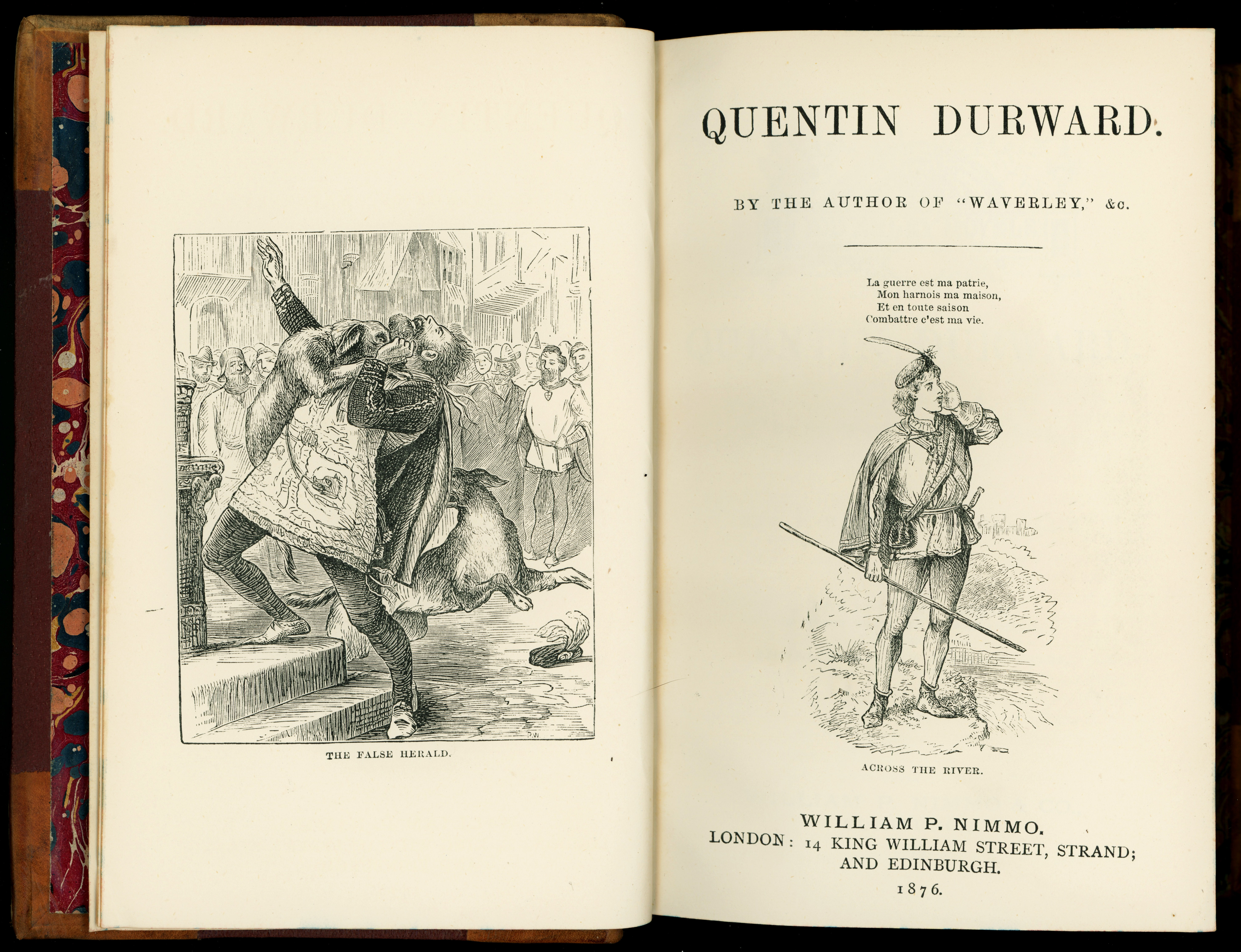
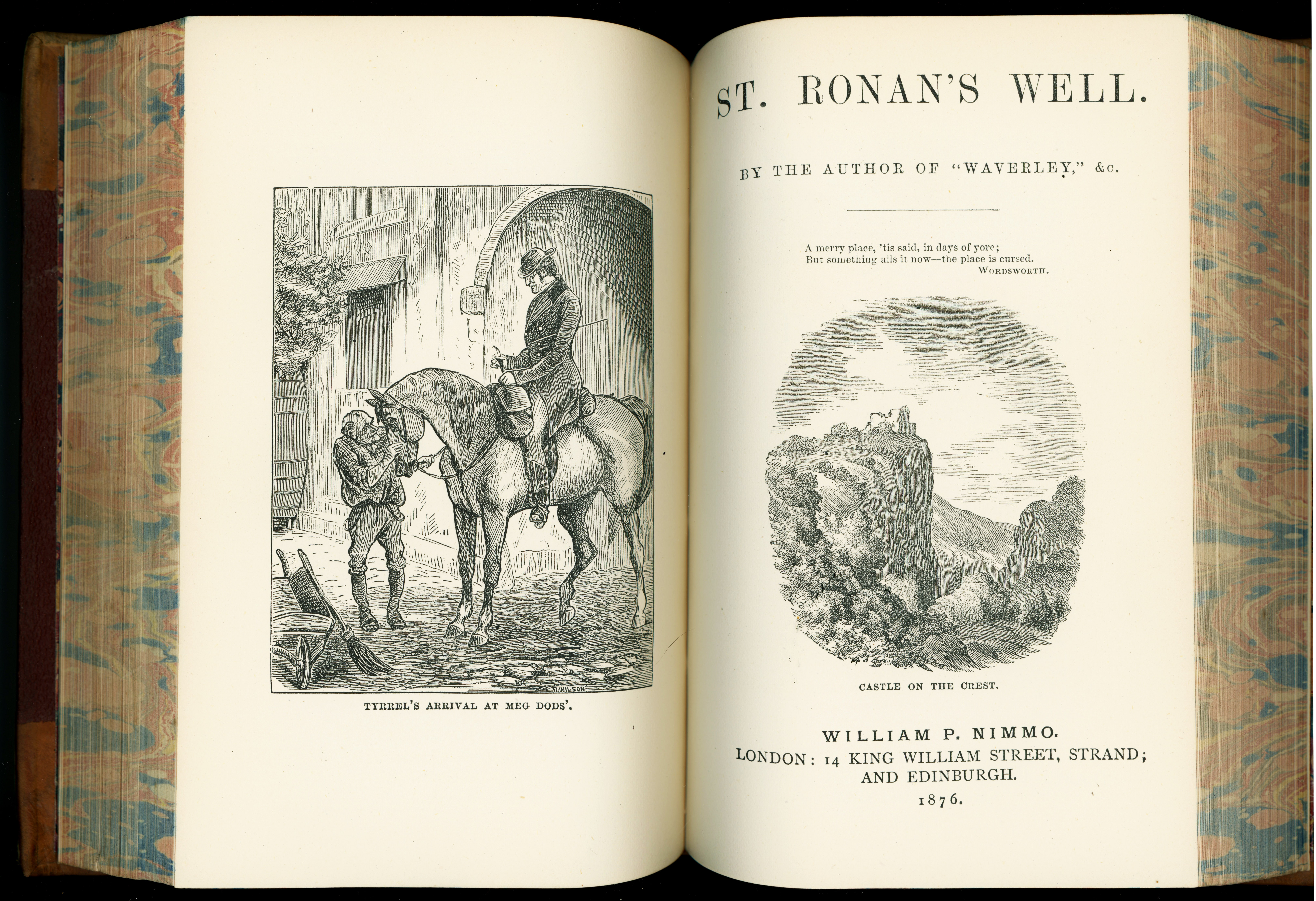
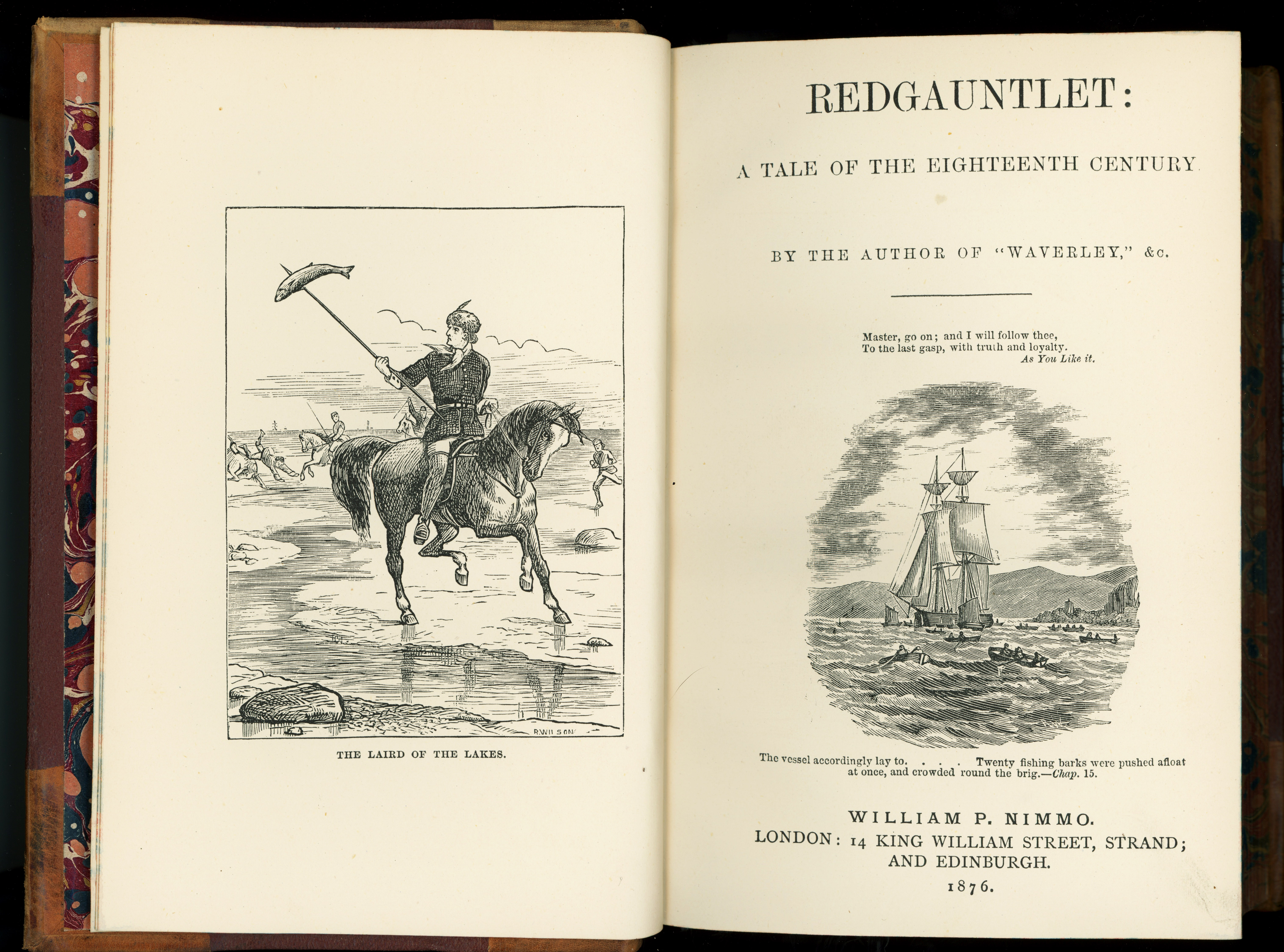
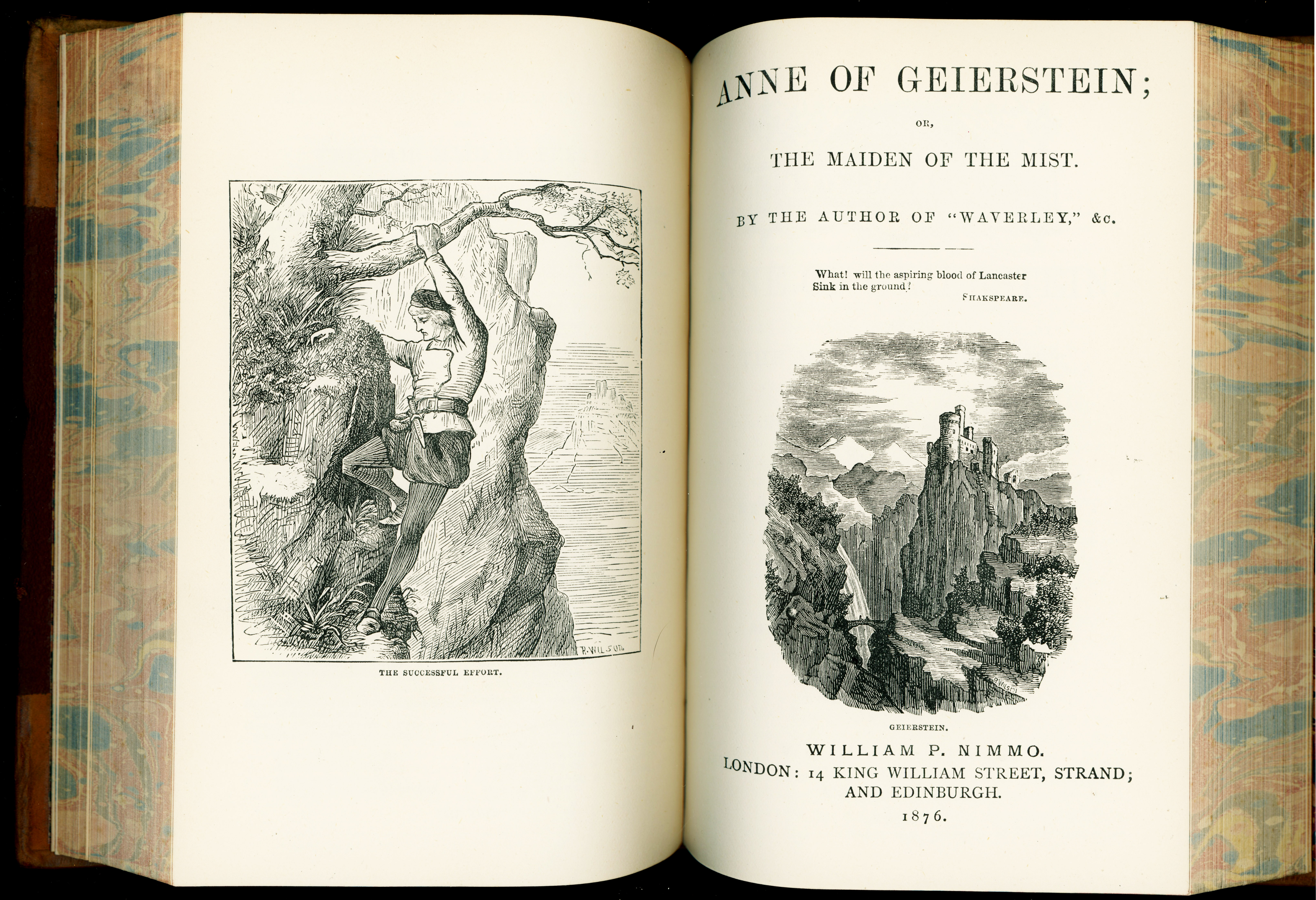
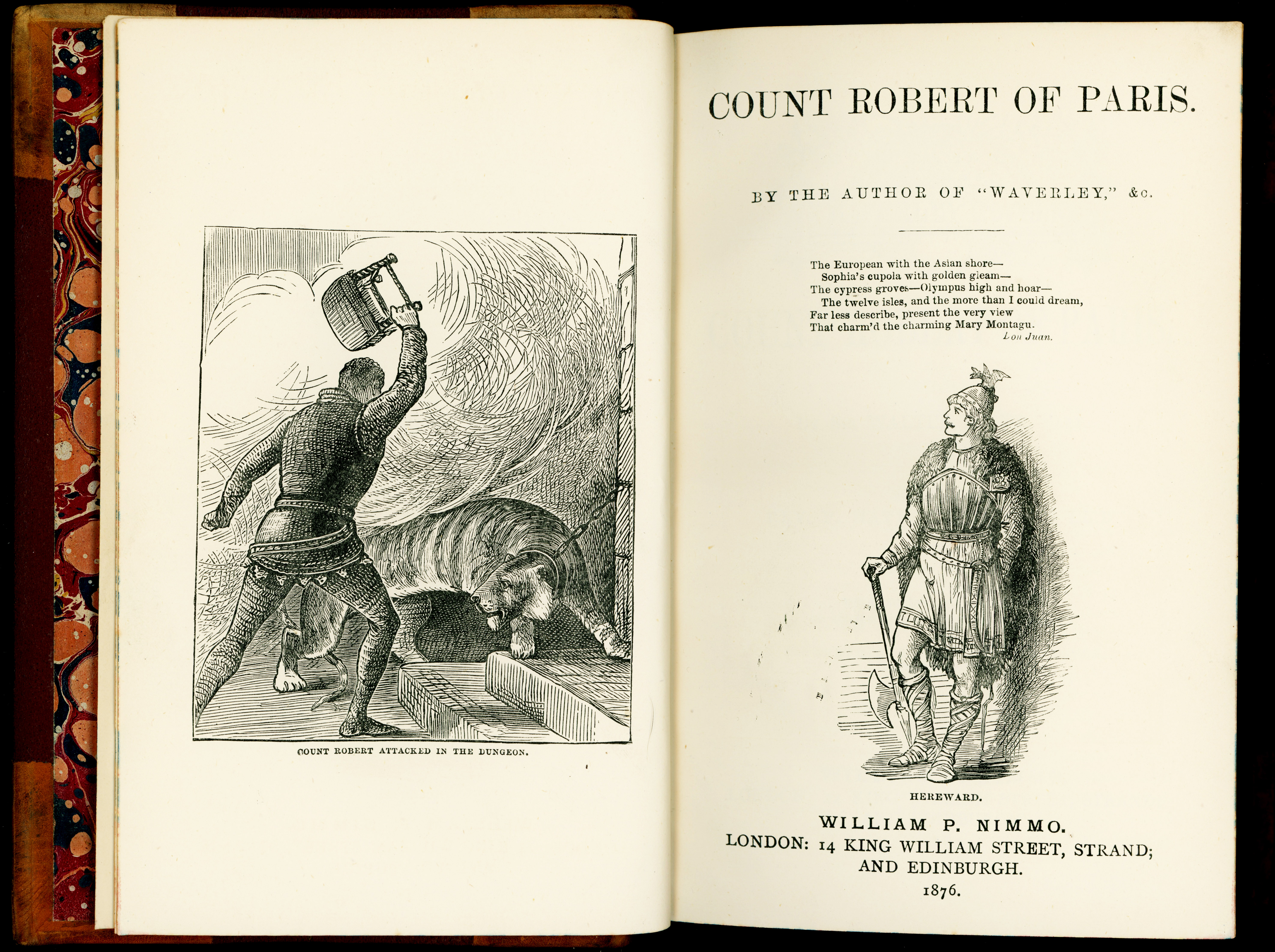
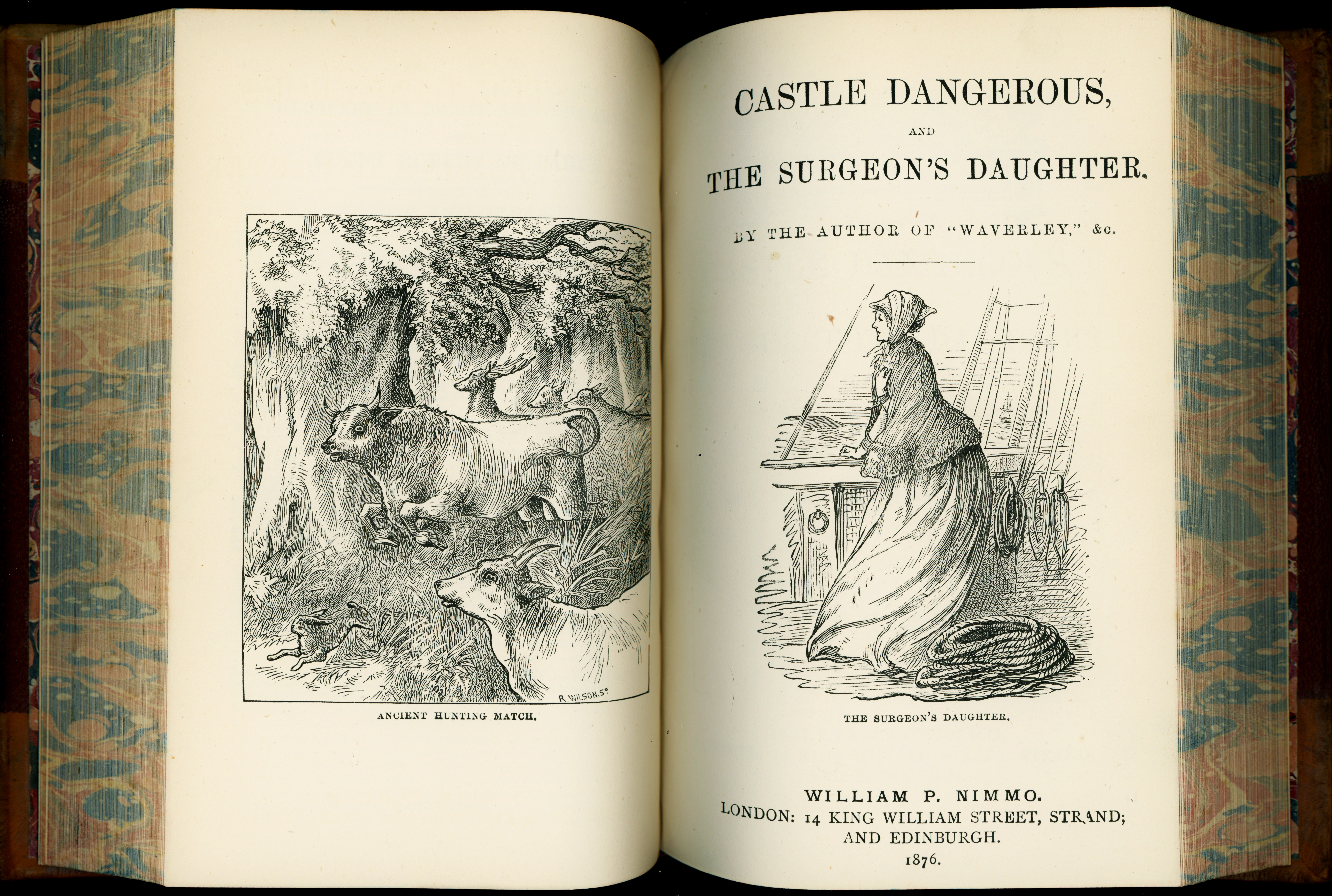
For my 75th birthday, a friend who now lives near Edinburgh brought me a stunning gift that he had carried in his luggage across the Atlantic. It’s a complete 13-volume set of Sir Walter Scott’s Waverley novels, bound in leather, printed in the Old Country in 1876. He bought the books at McNaughtan’s book shop in Edinburgh. There are 26 Waverley novels, two novels per volume.
Sir Walter Scott was once one of the most popular writers writing in English. Today, for whatever reason, very few people read him. I have read ten or eleven of his novels so far, and now that I have a complete set of the Waverley novels I’ll make a years-long project of reading all of them. I’ve written here previously about the novels of Walter Scott, and I don’t want to repeat myself, but you can search for “Walter” (on this blog’s main page) if you’re interested in my older posts.
We need a Walter Scott revival
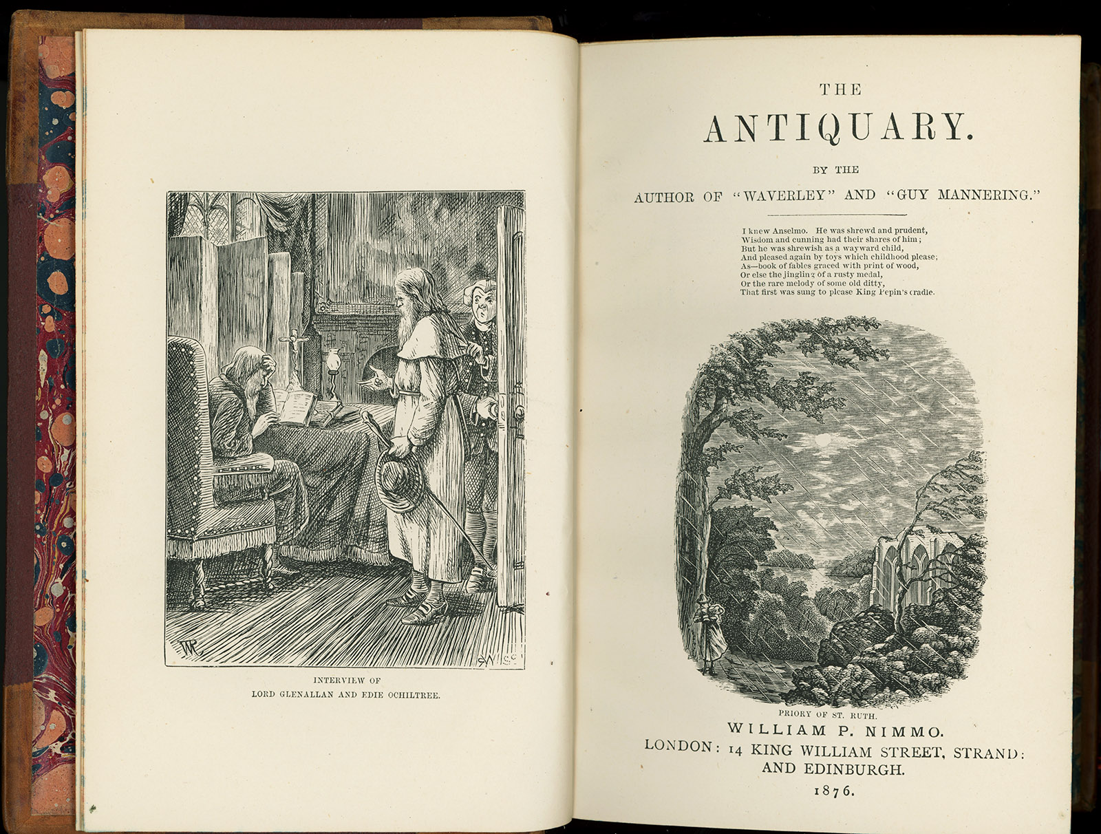
Sooner or later, it seems inevitable to me that, either in America or in Britain, someone will make a beautiful movie based on a Sir Walter Scott novel, and that will start a revival. Then, instead of my being a Walter Scott boor, people might start asking me for recommendations on what they might read. For the record, based on what I’ve read so far, I’d suggest The Heart of Mid-Lothian, or The Antiquary. I do not recommend Ivanhoe. Ivanhoe is not even set in Scotland, and its story of chivalry and Robin Hood will already be familiar to most people. It’s Scott’s stories about life in Old Scotland that I find most appealing — Highlands to Edinburgh, peasants to princes, castles to Highland huts, violent coastal storms to spring in the mountains, and all manner of speech and dialogue.
Yes, reading Scott can be hard work, even compared with other 19th Century writers. The structure of Scott’s novels also can be a deterrent. Typically, in the first third (or so), it appears that nothing is ever going to happen, as Scott introduces his characters and settings and sets up what writers call exposition, covering all the details and background that the reader needs to know to follow the story. In the last third of the book, things will definitely happen, and every element that was introduced early in the novel will play its part.
Where have these books been since 1876?
I was very curious to know whether any information about the previous owners of these books had survived. I emailed an inquiry to McNaughtan’s, and I received this reply:
Thank you for your enquiry. I am glad that you like the books and I can see even from your photo that they have found a home with plenty of friends around.
This set came to us from the estate of a collector of leather bindings based in the north of Scotland. They were likely previously acquired within either the Scottish book trade or from a London bookseller, beyond which the trail goes cold, I’m afraid. The most probable earlier history for the set is that they were originally bought by inhabitants of a large-ish house and remained there through several generations before entering the secondhand book trade.
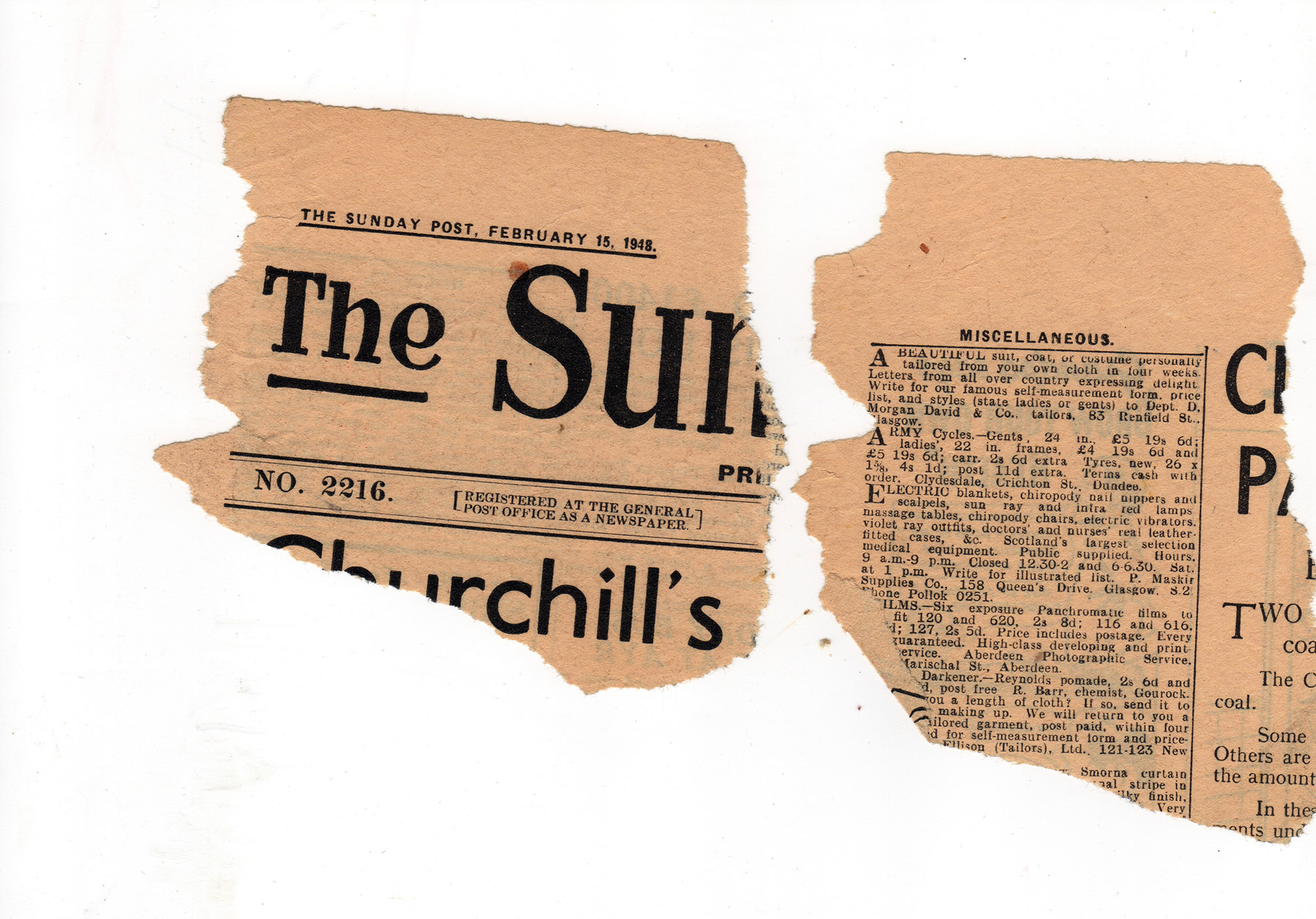
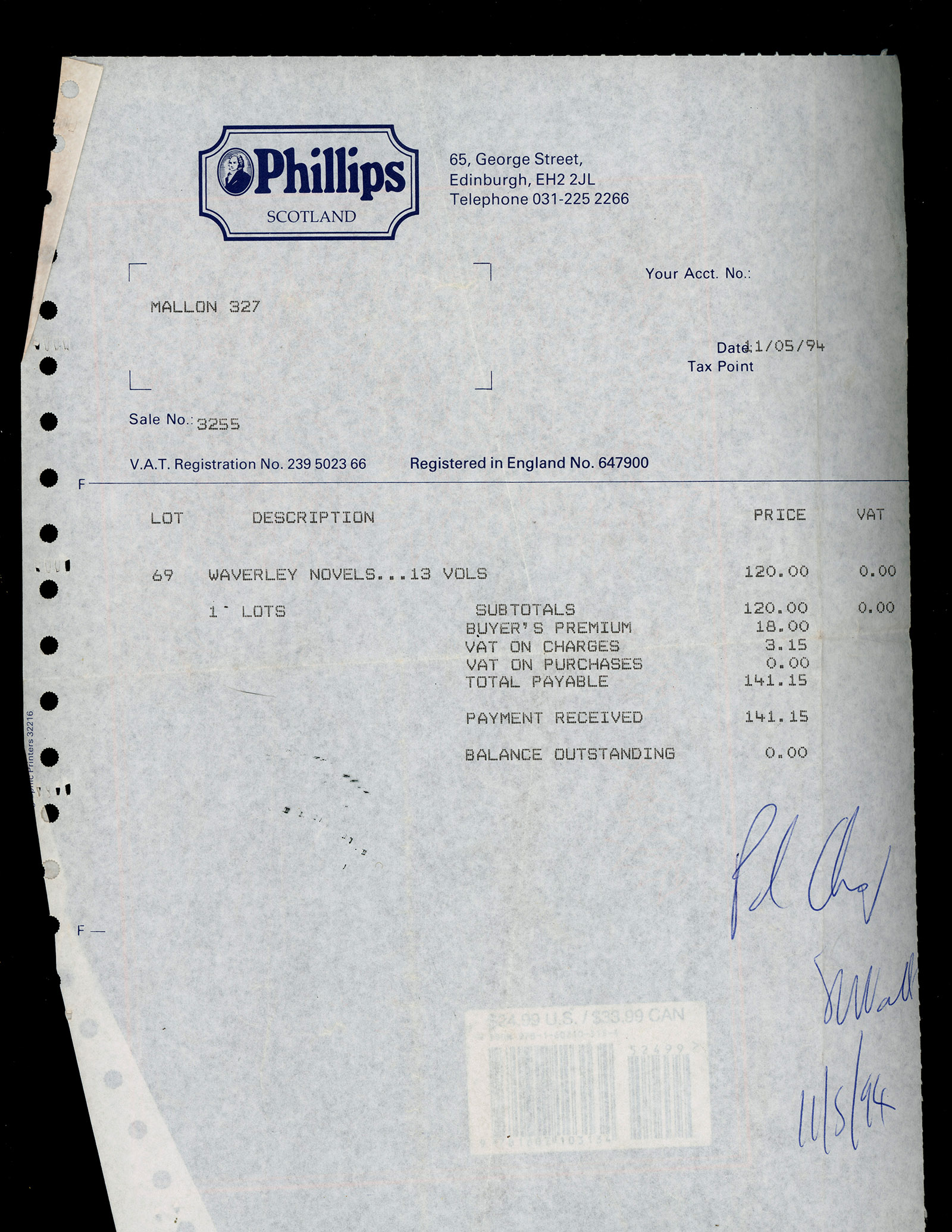
When I started scanning the illustrations, two clues were tucked inside the books (see below). Inside volume 9 were fragments of a Dundee newspaper dated February 15, 1948. In the back of volume 13 was an invoice. The books had been purchased at an auction in Edinburgh on November 5, 1994. A best guess, then, is that the original owners of the books lived in Dundee or thereabouts. The books probably were in the hands of the original owners until well after 1948. Then, probably in an estate sale in which the contents of a “large-ish house” were sold, the books were bought by a collector in 1994. Then that collector’s books were sold to McNaughtan’s much more recently.
I will never ask my friend how much he paid for this set of books, but some Googling reveals that, in 2000, Christie’s sold what appears to be the same set for £1,645.
The posthumous editions
My guess is that few universities other than the University of Edinburgh do Scott scholarship anymore. In Googling, I came across a thesis for a master’s degree at the University of Edinburgh, written in 2008 by Ruth M. McAdams. The title is “The Posthumous British Editions of Sir Walter Scott’s Waverley Novels, 1832-1871, and the Evolution of his Literary Legacy.” The abstract reads:
This thesis argues for the importance of the posthumous editions of Sir Walter Scott‟s Waverley Novels in shaping his literary reputation between 1832 and 1871. In the series of editions published by Robert Cadell and later A. & C. Black between Scott’s death and the centenary of his birth, changes were made to the paratextual presentation of the novels, particularly through illustrations and notes. By tracing these changes, I will show how Scott’s literary legacy evolves over this crucial period. Furthermore, by demonstrating that these posthumous editions reached a far wider audience than ever before, I will suggest that these editions, rather than any published during Scott’s lifetime, most powerfully shaped his status as a cultural icon in the nineteenth century. These editions are, thus, still important to the way that Sir Walter Scott’s place in the literary canon is understood.
There is even a reference in this paper to the Nimmo editions that I now have.
Why post all this?
More than half of the hits on this blog come from Google. Over the past 16 years, I’ve written on many subjects. Some of those subjects are not exactly in the mainstream, subjects on which one has to dig a little to find information. For example, a good many people have come here from Google to read my post from 2022, “We’re overdue for a Sir Walter Scott revival.” I suppose I’ve joined the rarefied ranks (most of them probably are in Edinburgh) of Scott evangelists longing for a Sir Walter Scott revival.
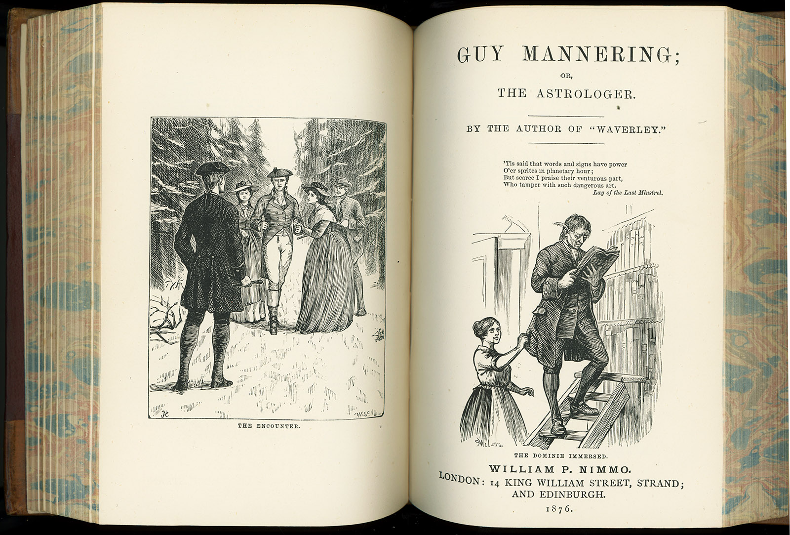
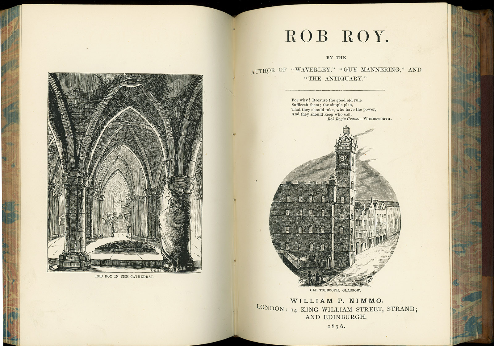
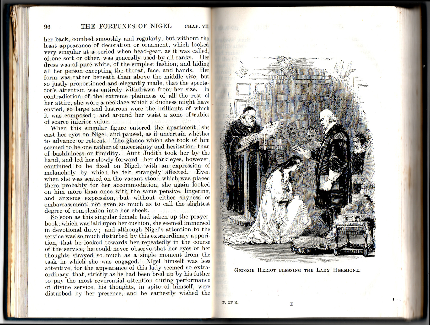
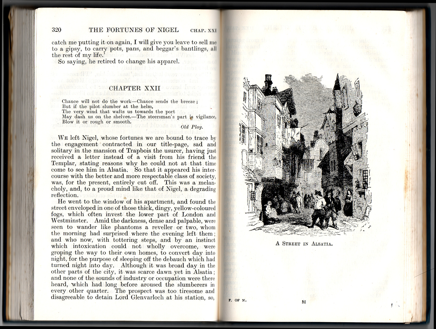
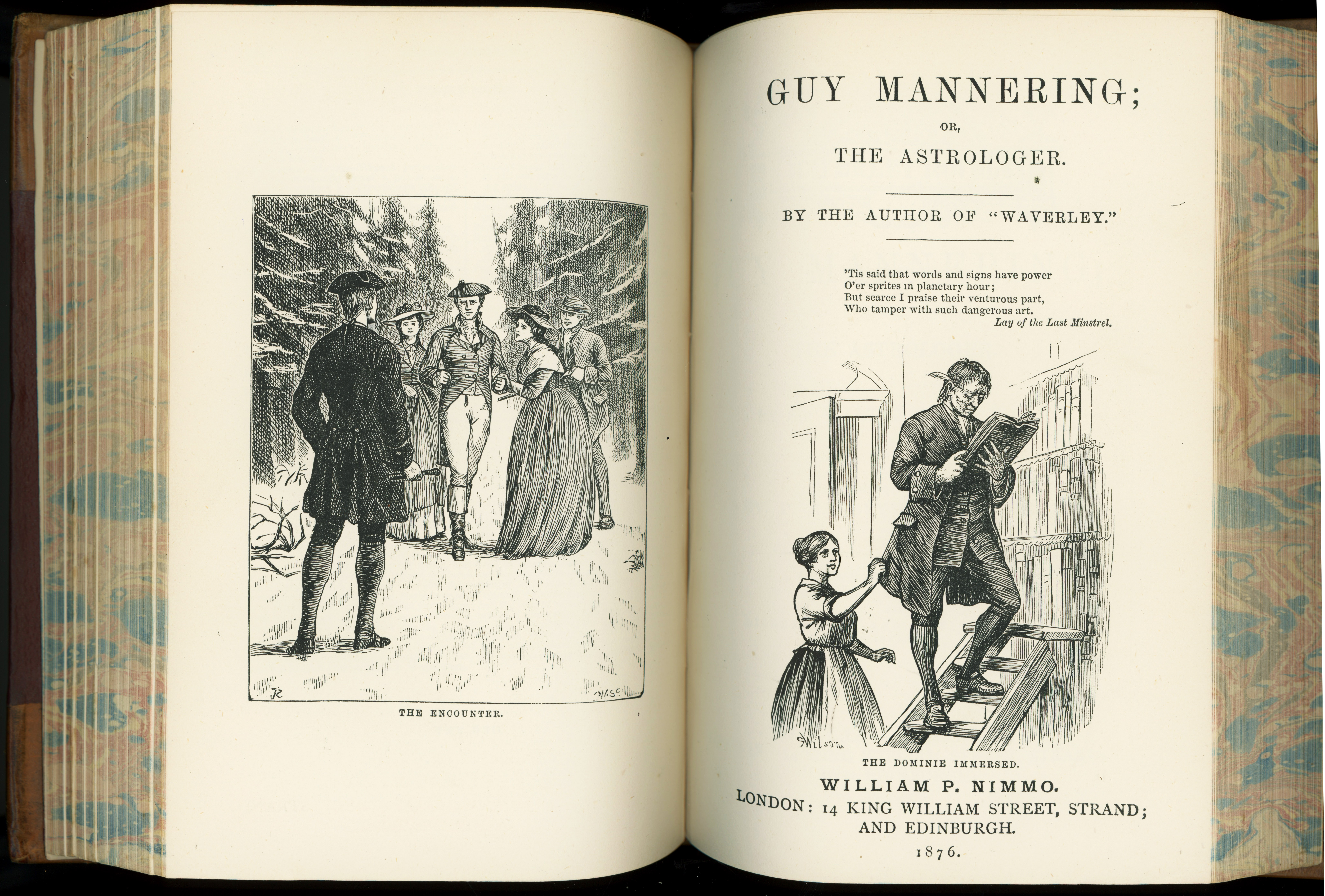
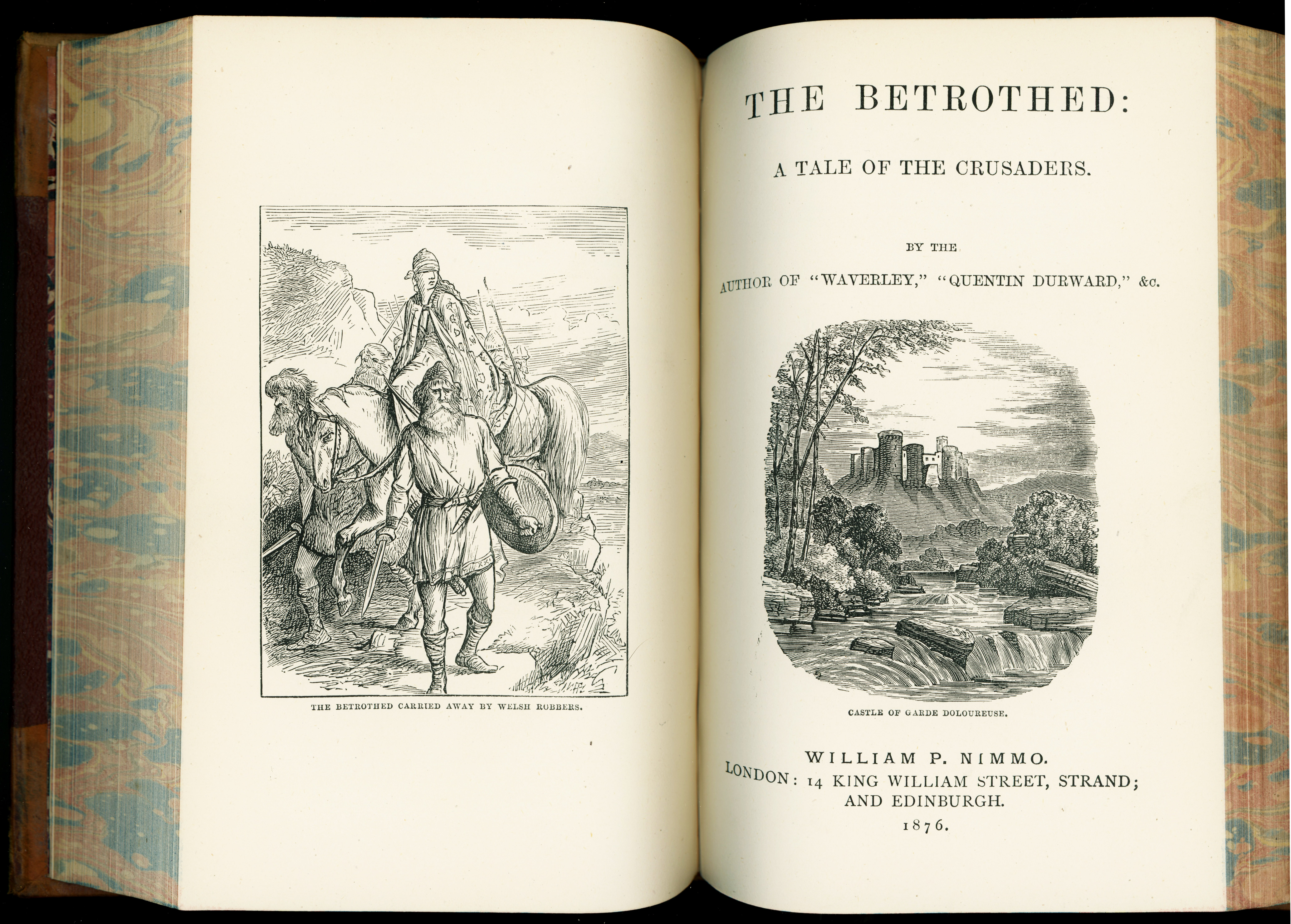
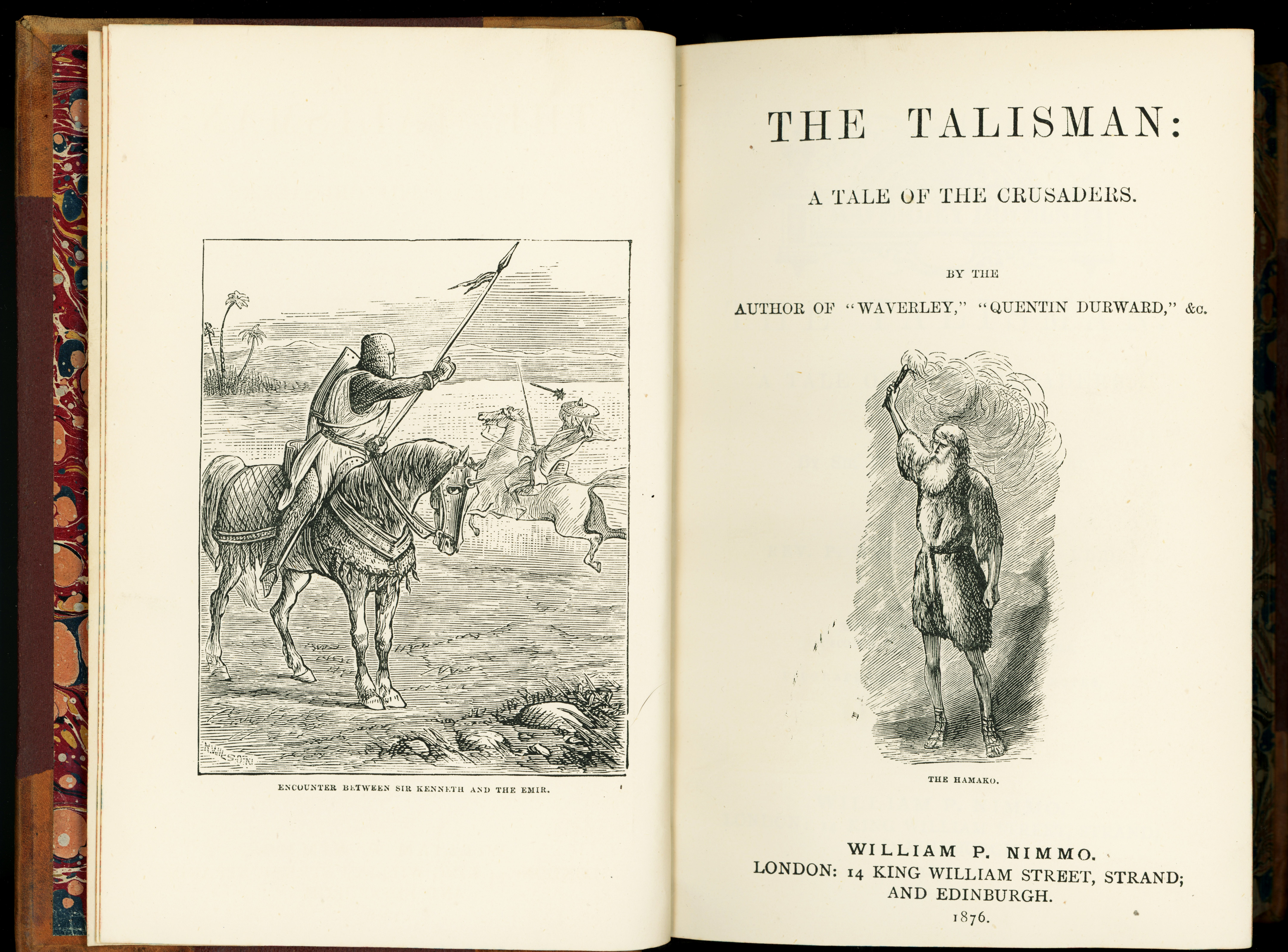
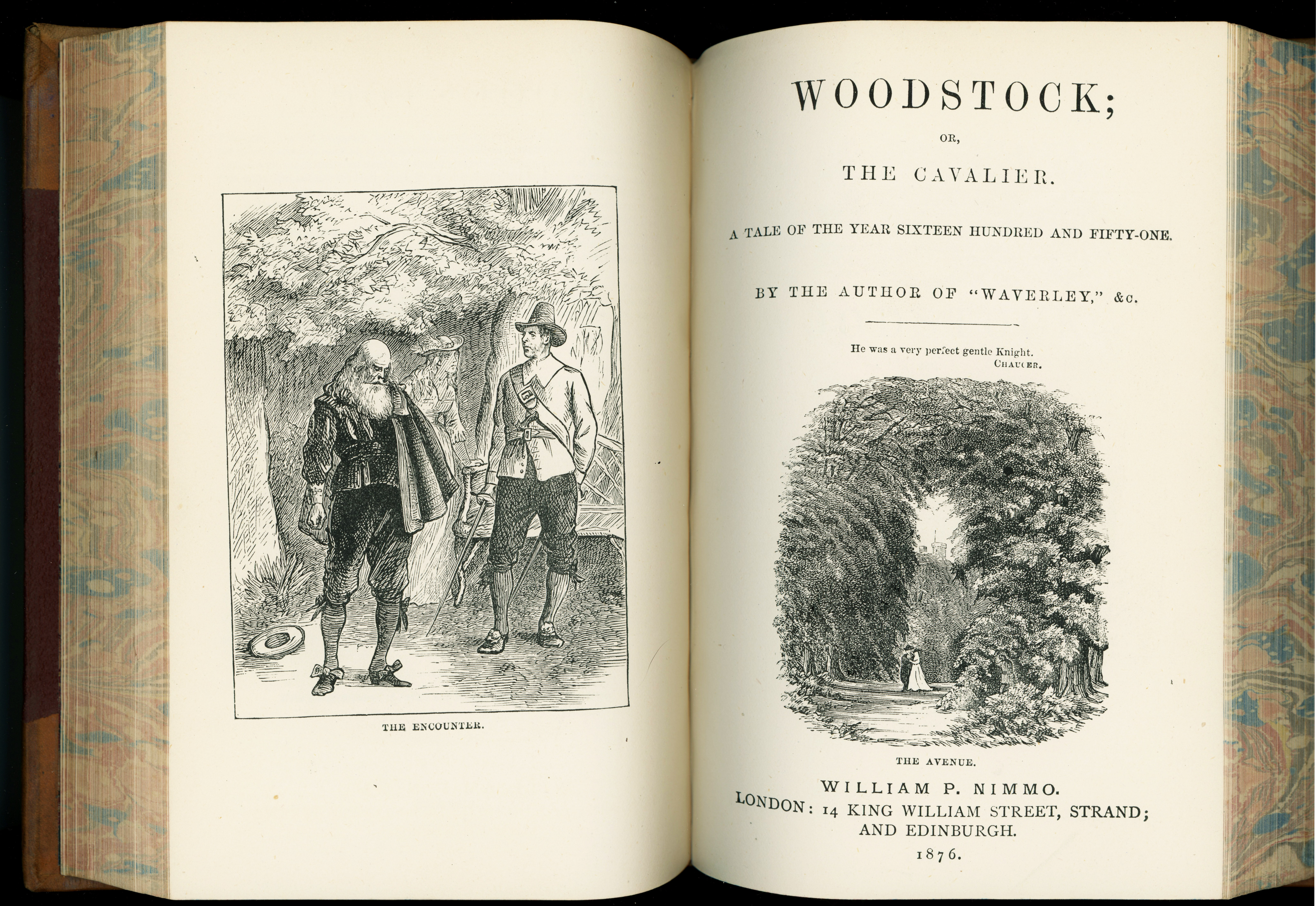
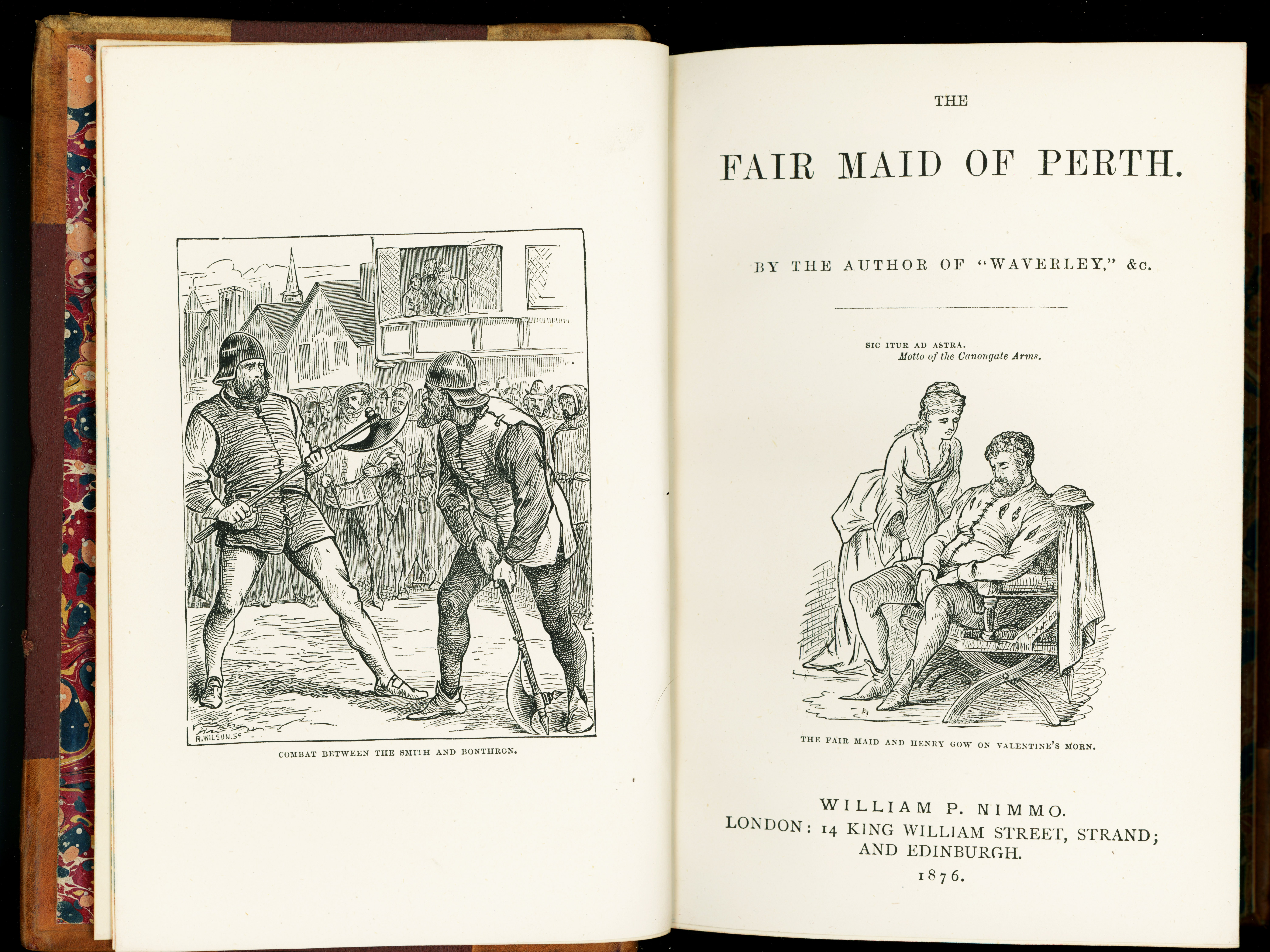
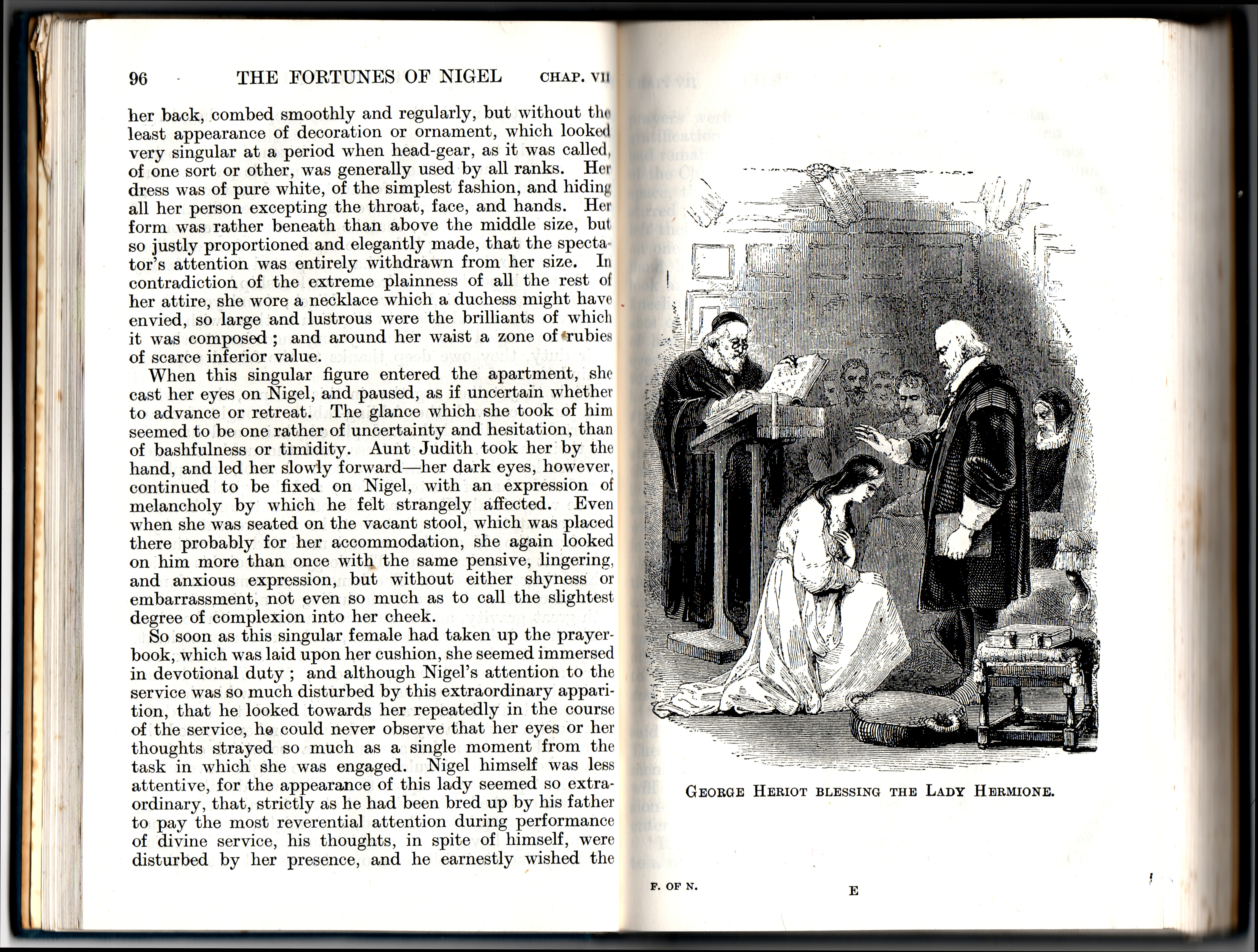
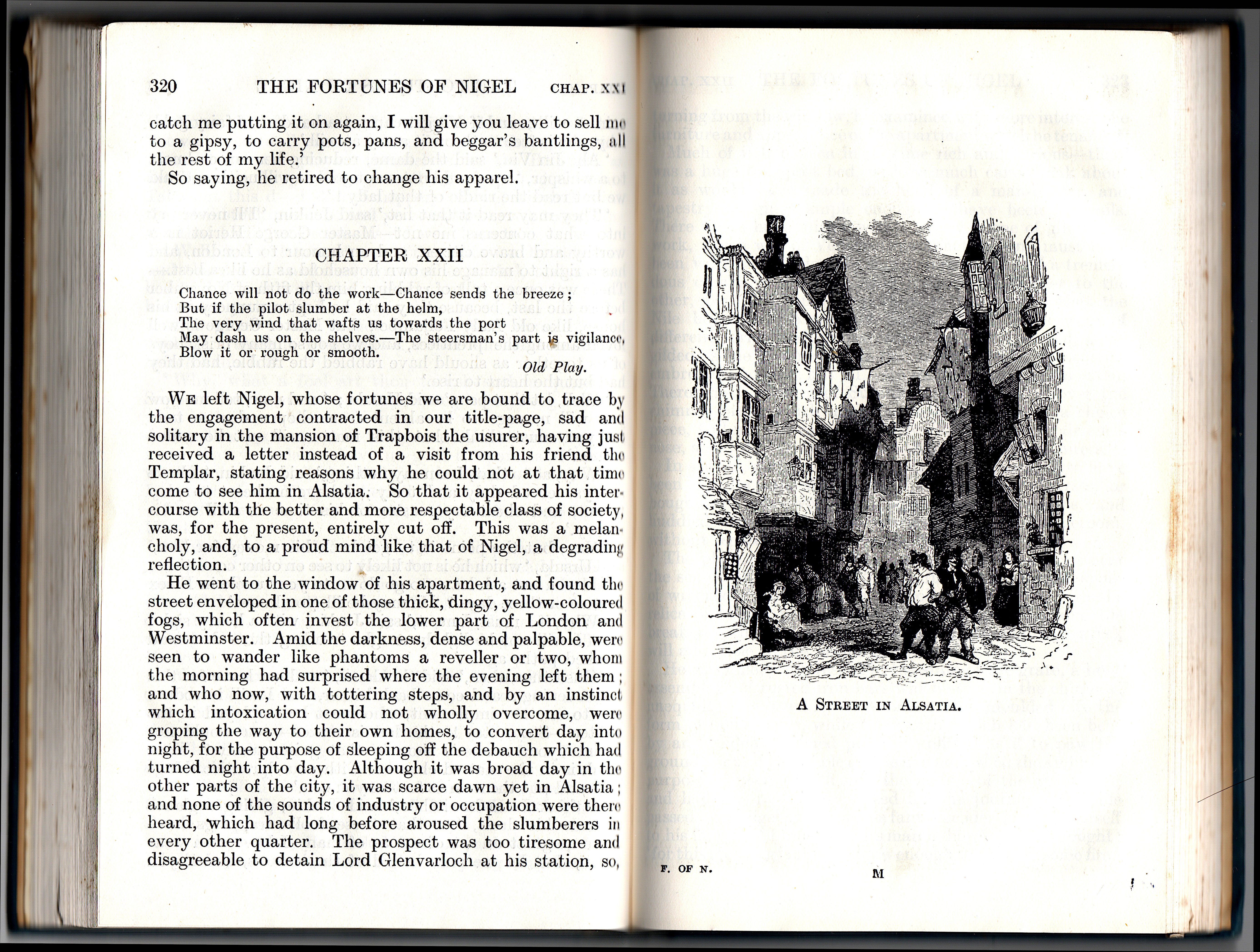
Also, the engravings in my Nimmo editions are beautiful and beautifully printed. They are, of course, in the public domain, and in addition to making them available here I’ll also post the scans at Wikimedia Commons.
Who was William P. Nimmo?
I was able to find very little information on William P. Nimmo. There’s not even a Wikipedia article. He was, however, a writer as well as a publisher.
Buying old editions
Good luck trying to find newly printed editions of Walter Scott’s novels! You can buy the 30-volume set from the Edinburgh University Press for $2,445. You’d be able to buy Ivanhoe easily enough on Amazon. But I highly recommend finding, reading, and preserving the old editions. There is a good market on eBay, both in the U.S. and in the U.K. If you buy a single copy, that copy probably came from a set which was broken up for sale. It’s sad that so many sets have been broken, but on eBay you’ll also find sets that are complete or nearly complete. These old editions, unless they’re rare and collectible, are not expensive.


